Text
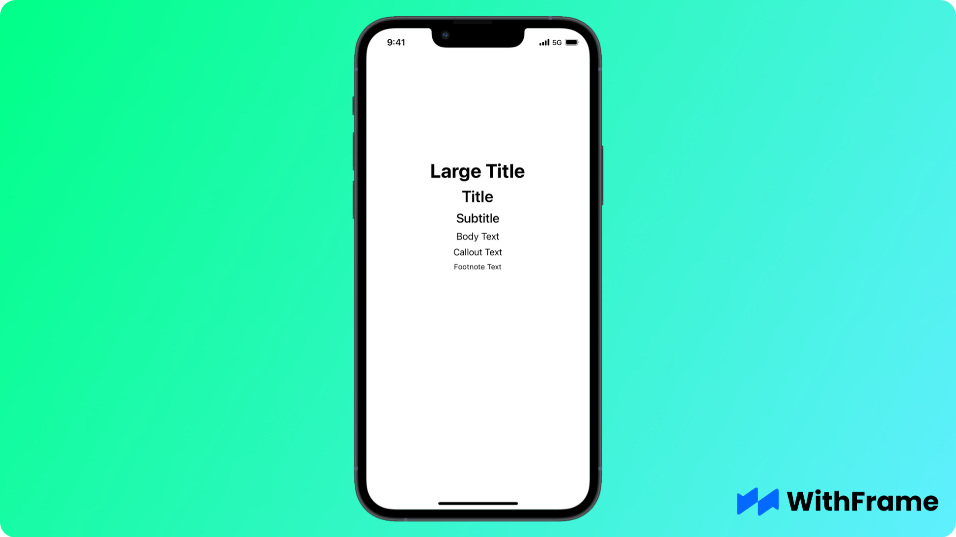
Text in React Native is a component that allows you to display one or more lines of text. This is suitable for read-only information that's not editable.
To use it, simply import Text from react-native package and render inside your component.
<View style={{ flex: 1 }}>
  <Text style={{ fontSize: 34, fontWeight: "bold" }}>Large Title</Text>
  <Text style={{ fontSize: 28, fontWeight: "600" }}>Title</Text>
  <Text style={{ fontSize: 22, fontWeight: "500" }}>Subtitle</Text>
  <Text style={{ fontSize: 17, fontWeight: "400" }}>Body Text</Text>
  <Text style={{ fontSize: 16, fontWeight: "400" }}>Callout Text</Text>
  <Text style={{ fontSize: 13, fontWeight: "400" }}>Footnote Text</Text>
</View>
Changing the Font
The style prop allows you to customize the text style. By default, it's going to use the default font specific to its platform. System fonts come with dynamic type, which automatically adjust its size for accessibility.
<Text style={{ fontFamily: "Helvetica", fontSize: 24 }}>Helvetica Font</Text>
System Fonts
You can use all system fonts that come with React Native.
<Text style={{ fontFamily: "Avenir", fontWeight: "bold", fontSize: 14 }}>
  Avenir Font
</Text>
List of iOS fonts available in React Native
Academy Engraved LETAcademyEngravedLetPlainAl NileAlNile-BoldAmerican TypewriterAmericanTypewriter-BoldAmericanTypewriter-CondensedAmericanTypewriter-CondensedBoldAmericanTypewriter-CondensedLightAmericanTypewriter-LightApple Color EmojiApple SD Gothic NeoAppleColorEmojiAppleSDGothicNeo-BoldAppleSDGothicNeo-LightAppleSDGothicNeo-MediumAppleSDGothicNeo-RegularAppleSDGothicNeo-SemiBoldAppleSDGothicNeo-ThinAppleSDGothicNeo-UltraLightArialArial HebrewArial Rounded MT BoldArial-BoldItalicMTArial-BoldMTArial-ItalicMTArialHebrewArialHebrew-BoldArialHebrew-LightArialMTArialRoundedMTBoldAvenirAvenir NextAvenir Next CondensedAvenir-BlackAvenir-BlackObliqueAvenir-BookAvenir-BookObliqueAvenir-HeavyAvenir-HeavyObliqueAvenir-LightAvenir-LightObliqueAvenir-MediumAvenir-MediumObliqueAvenir-ObliqueAvenir-RomanAvenirNext-BoldAvenirNext-BoldItalicAvenirNext-DemiBoldAvenirNext-DemiBoldItalicAvenirNext-HeavyAvenirNext-HeavyItalicAvenirNext-ItalicAvenirNext-MediumAvenirNext-MediumItalicAvenirNext-RegularAvenirNext-UltraLightAvenirNext-UltraLightItalicAvenirNextCondensed-BoldAvenirNextCondensed-BoldItalicAvenirNextCondensed-DemiBoldAvenirNextCondensed-DemiBoldItalicAvenirNextCondensed-HeavyAvenirNextCondensed-HeavyItalicAvenirNextCondensed-ItalicAvenirNextCondensed-MediumAvenirNextCondensed-MediumItalicAvenirNextCondensed-RegularAvenirNextCondensed-UltraLightAvenirNextCondensed-UltraLightItalicBangla Sangam MNBaskervilleBaskerville-BoldBaskerville-BoldItalicBaskerville-ItalicBaskerville-SemiBoldBaskerville-SemiBoldItalicBodoni 72Bodoni 72 OldstyleBodoni 72 SmallcapsBodoni OrnamentsBodoniOrnamentsITCTTBodoniSvtyTwoITCTT-BoldBodoniSvtyTwoITCTT-BookBodoniSvtyTwoITCTT-BookItaBodoniSvtyTwoOSITCTT-BoldBodoniSvtyTwoOSITCTT-BookBodoniSvtyTwoSCITCTT-BookBradley HandBradleyHandITCTT-BoldChalkboard SEChalkboardSE-BoldChalkboardSE-LightChalkboardSE-RegularChalkdusterChalkdusterCochinCochin-BoldCochin-BoldItalicCochin-ItalicCopperplateCopperplate-BoldCopperplate-LightCourierCourier NewCourier-BoldCourier-BoldObliqueCourier-ObliqueCourierNewPS-BoldItalicMTCourierNewPS-BoldMTCourierNewPS-ItalicMTCourierNewPSMTDamascusDamascusBoldDamascusLightDamascusMediumDamascusSemiBoldDevanagari Sangam MNDevanagariSangamMNDevanagariSangamMN-BoldDidotDidot-BoldDidot-ItalicDiwanMishafiEuphemia UCASEuphemiaUCAS-BoldEuphemiaUCAS-ItalicFarahFuturaFutura-CondensedExtraBoldFutura-CondensedMediumFutura-MediumFutura-MediumItalicGeeza ProGeezaPro-BoldGeorgiaGeorgia-BoldGeorgia-BoldItalicGeorgia-ItalicGill SansGillSans-BoldGillSans-BoldItalicGillSans-ItalicGillSans-LightGillSans-LightItalicGillSans-SemiBoldGillSans-SemiBoldItalicGillSans-UltraBoldGujarati Sangam MNGujaratiSangamMNGujaratiSangamMN-BoldGurmukhi MNGurmukhiMN-BoldHeiti SCHeiti TCHelveticaHelvetica NeueHelvetica-BoldHelvetica-BoldObliqueHelvetica-LightHelvetica-LightObliqueHelvetica-ObliqueHelveticaNeue-BoldHelveticaNeue-BoldItalicHelveticaNeue-CondensedBlackHelveticaNeue-CondensedBoldHelveticaNeue-ItalicHelveticaNeue-LightHelveticaNeue-LightItalicHelveticaNeue-MediumHelveticaNeue-MediumItalicHelveticaNeue-ThinHelveticaNeue-ThinItalicHelveticaNeue-UltraLightHelveticaNeue-UltraLightItalicHiragino Mincho ProNHiragino SansHiraginoSans-W3HiraginoSans-W6HiraMinProN-W3HiraMinProN-W6Hoefler TextHoeflerText-BlackHoeflerText-BlackItalicHoeflerText-ItalicHoeflerText-RegularIowan Old StyleIowanOldStyle-BoldIowanOldStyle-BoldItalicIowanOldStyle-ItalicIowanOldStyle-RomanKailasaKailasa-BoldKannada Sangam MNKannadaSangamMNKannadaSangamMN-BoldKhmer Sangam MNKohinoor BanglaKohinoor DevanagariKohinoor TeluguKohinoorBangla-LightKohinoorBangla-RegularKohinoorBangla-SemiboldKohinoorDevanagari-LightKohinoorDevanagari-RegularKohinoorDevanagari-SemiboldKohinoorTelugu-LightKohinoorTelugu-MediumKohinoorTelugu-RegularLao Sangam MNMalayalam Sangam MNMalayalamSangamMNMalayalamSangamMN-BoldMarker FeltMarkerFelt-ThinMarkerFelt-WideMenloMenlo-BoldMenlo-BoldItalicMenlo-ItalicMenlo-RegularMishafiNoteworthyNoteworthy-BoldNoteworthy-LightOptimaOptima-BoldOptima-BoldItalicOptima-ExtraBlackOptima-ItalicOptima-RegularOriya Sangam MNOriyaSangamMNOriyaSangamMN-BoldPalatinoPalatino-BoldPalatino-BoldItalicPalatino-ItalicPalatino-RomanPapyrusPapyrus-CondensedParty LETPartyLetPlainPingFang HKPingFang SCPingFang TCPingFangHK-LightPingFangHK-MediumPingFangHK-RegularPingFangHK-SemiboldPingFangHK-ThinPingFangHK-UltralightPingFangSC-LightPingFangSC-MediumPingFangSC-RegularPingFangSC-SemiboldPingFangSC-ThinPingFangSC-UltralightPingFangTC-LightPingFangTC-MediumPingFangTC-RegularPingFangTC-SemiboldPingFangTC-ThinPingFangTC-UltralightSavoye LETSavoyeLetPlainSinhala Sangam MNSinhalaSangamMNSinhalaSangamMN-BoldSnell RoundhandSnellRoundhand-BlackSnellRoundhand-BoldSymbolTamil Sangam MNTamilSangamMN-BoldTelugu Sangam MNThonburiThonburi-BoldThonburi-LightTimes New RomanTimesNewRomanPS-BoldItalicMTTimesNewRomanPS-BoldMTTimesNewRomanPS-ItalicMTTimesNewRomanPSMTTrebuchet MSTrebuchet-BoldItalicTrebuchetMS-BoldTrebuchetMS-ItalicVerdanaVerdana-BoldVerdana-BoldItalicVerdana-ItalicZapf DingbatsZapfDingbatsITCZapfino
List of Android fonts available in React Native
normalnotoserifsans-serifsans-serif-lightsans-serif-thinsans-serif-condensedsans-serif-mediumserifRobotomonospace
Alignment and sizing
You can add the style prop with width, height and textAlign attributes. This is especially useful for multi-line texts.
<Text style={{ width: 100, textAlign: "left" }}>
  Est culpa velit pariatur proident qui pariatur veniam irure ullamco pariatur
  officia magna.
</Text>
Line Spacing
Add more space between the lines with the lineHeight prop.
<Text style={{ lineHeight: 20 }}>
  Elit non qui pariatur dolore fugiat incididunt ea aute Lorem ex. Aliqua magna
  exercitation non quis. Ad Lorem incididunt commodo nostrud proident do duis
  Lorem.
</Text>
Line Limit
Limit the number of lines for your text with the numberOfLines prop. Overflowing characters will have the ellipsis at the end.
<Text numberOfLines={1}>
  Sunt occaecat dolor occaecat est. In adipisicing excepteur in exercitation
  aute adipisicing labore enim velit cillum exercitation consectetur.
</Text>