Simple Empty State with Skeleton
Screen is created using these React Native Core Components: <SafeAreaView />, <View />, <TouchableOpacity />, <Text />
import React from 'react';
import {
  StyleSheet,
  SafeAreaView,
  View,
  TouchableOpacity,
  Text,
} from 'react-native';
import FeatherIcon from 'react-native-vector-icons/Feather';
import MaterialCommunityIcons from 'react-native-vector-icons/MaterialCommunityIcons';

export default function Example() {
  return (
    <SafeAreaView style={{ flex: 1, backgroundColor: '#fff' }}>
      <View style={styles.container}>
        <View style={styles.header}>
          <View style={styles.headerTop}>
            <View style={styles.headerAction} />

            <View style={styles.headerAction}>
              <TouchableOpacity
                onPress={() => {
                  // handle onPress
                }}>
                <FeatherIcon
                  color="#266EF1"
                  name="user-plus"
                  size={21} />
              </TouchableOpacity>
            </View>
          </View>

          <Text style={styles.headerTitle}>Messages</Text>
        </View>

        <View style={styles.empty}>
          <View style={styles.fake}>
            <View style={styles.fakeCircle} />

            <View>
              <View style={[styles.fakeLine, { width: 120 }]} />

              <View style={styles.fakeLine} />

              <View
                style={[
                  styles.fakeLine,
                  { width: 70, marginBottom: 0 },
                ]} />
            </View>
          </View>

          <View style={[styles.fake, { opacity: 0.5 }]}>
            <View style={styles.fakeCircle} />

            <View>
              <View style={[styles.fakeLine, { width: 120 }]} />

              <View style={styles.fakeLine} />

              <View
                style={[
                  styles.fakeLine,
                  { width: 70, marginBottom: 0 },
                ]} />
            </View>
          </View>

          <Text style={styles.emptyTitle}>Your inbox is empty</Text>

          <Text style={styles.emptyDescription}>
            Once you start a new conversation, you'll see new messages here
          </Text>
        </View>

        <TouchableOpacity
          onPress={() => {
            // handle onPress
          }}>
          <View style={styles.btn}>
            <View style={{ width: 34 }} />

            <Text style={styles.btnText}>Start New Conversation</Text>

            <MaterialCommunityIcons
              color="#fff"
              name="plus"
              size={22}
              style={{ marginLeft: 12 }} />
          </View>
        </TouchableOpacity>
      </View>
    </SafeAreaView>
  );
}

const styles = StyleSheet.create({
  container: {
    paddingBottom: 24,
    flexGrow: 1,
    flexShrink: 1,
    flexBasis: 0,
  },
  /** Header */
  header: {
    paddingHorizontal: 16,
    marginBottom: 12,
  },
  headerTop: {
    marginHorizontal: -6,
    flexDirection: 'row',
    alignItems: 'center',
    justifyContent: 'space-between',
  },
  headerAction: {
    width: 40,
    height: 40,
    alignItems: 'center',
    justifyContent: 'center',
  },
  headerTitle: {
    fontSize: 35,
    fontWeight: '700',
    color: '#1d1d1d',
  },
  /** Empty */
  empty: {
    flexGrow: 1,
    flexShrink: 1,
    flexBasis: 0,
    alignItems: 'center',
    justifyContent: 'center',
    marginBottom: 100,
  },
  emptyTitle: {
    fontSize: 19,
    fontWeight: '700',
    color: '#222',
    marginBottom: 8,
    marginTop: 12,
  },
  emptyDescription: {
    fontSize: 15,
    lineHeight: 22,
    fontWeight: '500',
    color: '#8c9197',
    textAlign: 'center',
  },
  /** Fake */
  fake: {
    flexDirection: 'row',
    alignItems: 'center',
    justifyContent: 'center',
    marginBottom: 24,
  },
  fakeCircle: {
    width: 44,
    height: 44,
    borderRadius: 9999,
    backgroundColor: '#e8e9ed',
    marginRight: 16,
  },
  fakeLine: {
    width: 200,
    height: 10,
    borderRadius: 4,
    backgroundColor: '#e8e9ed',
    marginBottom: 8,
  },
  /** Button */
  btn: {
    flexDirection: 'row',
    alignItems: 'center',
    justifyContent: 'center',
    borderRadius: 8,
    paddingVertical: 10,
    paddingHorizontal: 20,
    borderWidth: 1,
    backgroundColor: '#266EF1',
    borderColor: '#266EF1',
    marginTop: 'auto',
    marginHorizontal: 24,
  },
  btnText: {
    fontSize: 18,
    lineHeight: 26,
    fontWeight: '600',
    color: '#fff',
  },
});
import React from 'react';
import {
StyleSheet,
SafeAreaView,
View,
TouchableOpacity,
Text,
} from 'react-native';
import FeatherIcon from '@expo/vector-icons/Feather';
import MaterialCommunityIcons from '@expo/vector-icons/MaterialCommunityIcons';
export default function Example() {
return (
<SafeAreaView style={{ flex: 1, backgroundColor: '#fff' }}>
<View style={styles.container}>
<View style={styles.header}>
<View style={styles.headerTop}>
<View style={styles.headerAction} />
<View style={styles.headerAction}>
<TouchableOpacity
onPress={() => {
// handle onPress
}}>
<FeatherIcon
color="#266EF1"
name="user-plus"
size={21} />
</TouchableOpacity>
</View>
</View>
<Text style={styles.headerTitle}>Messages</Text>
</View>
<View style={styles.empty}>
<View style={styles.fake}>
<View style={styles.fakeCircle} />
<View>
<View style={[styles.fakeLine, { width: 120 }]} />
<View style={styles.fakeLine} />
<View
style={[
styles.fakeLine,
{ width: 70, marginBottom: 0 },
]} />
</View>
</View>
<View style={[styles.fake, { opacity: 0.5 }]}>
<View style={styles.fakeCircle} />
<View>
<View style={[styles.fakeLine, { width: 120 }]} />
<View style={styles.fakeLine} />
<View
style={[
styles.fakeLine,
{ width: 70, marginBottom: 0 },
]} />
</View>
</View>
<Text style={styles.emptyTitle}>Your inbox is empty</Text>
<Text style={styles.emptyDescription}>
Once you start a new conversation, you'll see new messages here
</Text>
</View>
<TouchableOpacity
onPress={() => {
// handle onPress
}}>
<View style={styles.btn}>
<View style={{ width: 34 }} />
<Text style={styles.btnText}>Start New Conversation</Text>
<MaterialCommunityIcons
color="#fff"
name="plus"
size={22}
style={{ marginLeft: 12 }} />
</View>
</TouchableOpacity>
</View>
</SafeAreaView>
);
}
const styles = StyleSheet.create({
container: {
paddingBottom: 24,
flexGrow: 1,
flexShrink: 1,
flexBasis: 0,
},
/** Header */
header: {
paddingHorizontal: 16,
marginBottom: 12,
},
headerTop: {
marginHorizontal: -6,
flexDirection: 'row',
alignItems: 'center',
justifyContent: 'space-between',
},
headerAction: {
width: 40,
height: 40,
alignItems: 'center',
justifyContent: 'center',
},
headerTitle: {
fontSize: 35,
fontWeight: '700',
color: '#1d1d1d',
},
/** Empty */
empty: {
flexGrow: 1,
flexShrink: 1,
flexBasis: 0,
alignItems: 'center',
justifyContent: 'center',
marginBottom: 100,
},
emptyTitle: {
fontSize: 19,
fontWeight: '700',
color: '#222',
marginBottom: 8,
marginTop: 12,
},
emptyDescription: {
fontSize: 15,
lineHeight: 22,
fontWeight: '500',
color: '#8c9197',
textAlign: 'center',
},
/** Fake */
fake: {
flexDirection: 'row',
alignItems: 'center',
justifyContent: 'center',
marginBottom: 24,
},
fakeCircle: {
width: 44,
height: 44,
borderRadius: 9999,
backgroundColor: '#e8e9ed',
marginRight: 16,
},
fakeLine: {
width: 200,
height: 10,
borderRadius: 4,
backgroundColor: '#e8e9ed',
marginBottom: 8,
},
/** Button */
btn: {
flexDirection: 'row',
alignItems: 'center',
justifyContent: 'center',
borderRadius: 8,
paddingVertical: 10,
paddingHorizontal: 20,
borderWidth: 1,
backgroundColor: '#266EF1',
borderColor: '#266EF1',
marginTop: 'auto',
marginHorizontal: 24,
},
btnText: {
fontSize: 18,
lineHeight: 26,
fontWeight: '600',
color: '#fff',
},
});Dependencies
Before getting started, make sure you have all the necessary dependencies for this component. Follow the steps below to install any missing dependencies.
Install the package.
npm install --save react-native-vector-icons
Link the native packages for iOS.
npx pod-install
In React Native 0.60+ the CLI autolink feature links the module while building the app.
Add Fonts to the
Info.plistfile.
Open your XCode project, right click on the Info.plist, and select Open As -> Source Code.
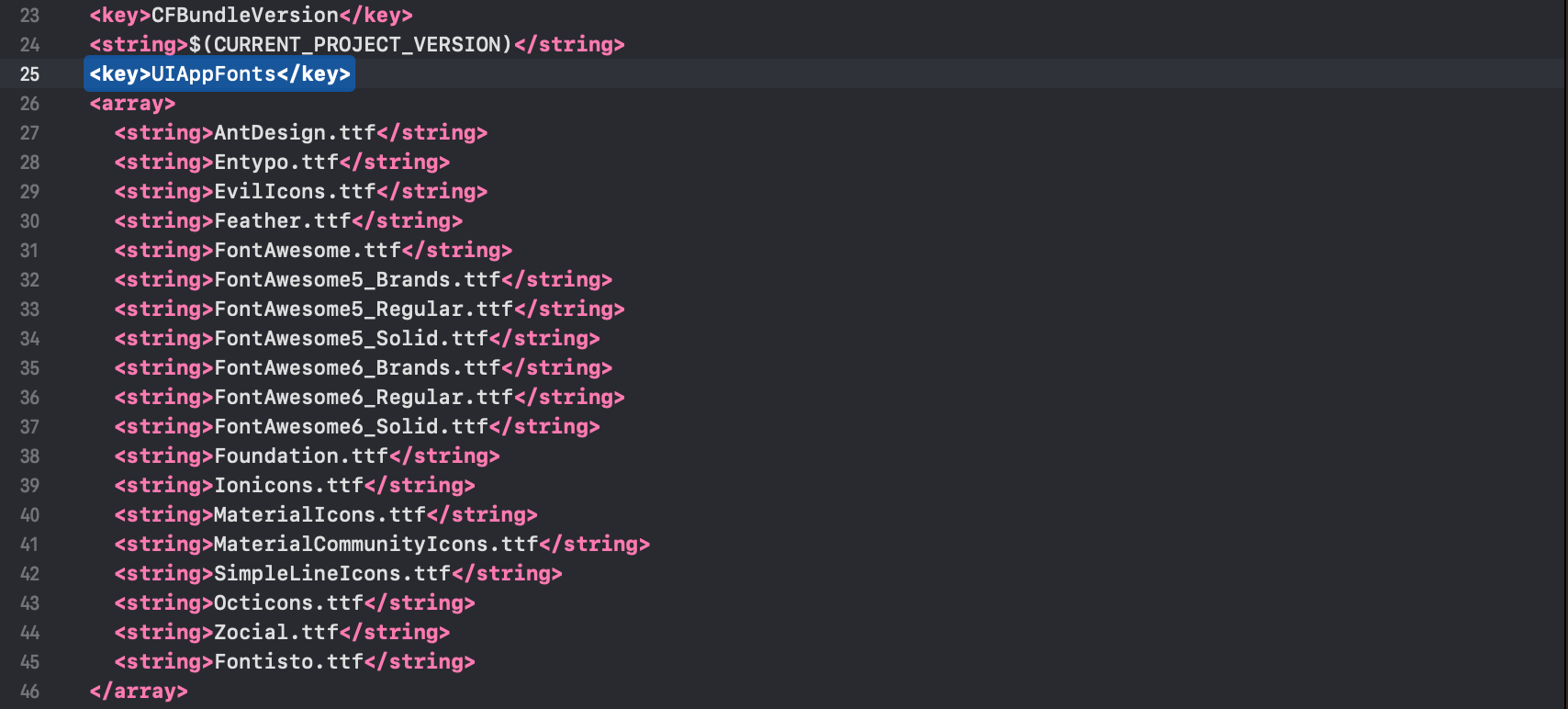
Next, copy the fonts below into your Info.plist.
<key>UIAppFonts</key>
<array>
  <string>AntDesign.ttf</string>
  <string>Entypo.ttf</string>
  <string>EvilIcons.ttf</string>
  <string>Feather.ttf</string>
  <string>FontAwesome.ttf</string>
  <string>FontAwesome5_Brands.ttf</string>
  <string>FontAwesome5_Regular.ttf</string>
  <string>FontAwesome5_Solid.ttf</string>
  <string>FontAwesome6_Brands.ttf</string>
  <string>FontAwesome6_Regular.ttf</string>
  <string>FontAwesome6_Solid.ttf</string>
  <string>Foundation.ttf</string>
  <string>Ionicons.ttf</string>
  <string>MaterialIcons.ttf</string>
  <string>MaterialCommunityIcons.ttf</string>
  <string>SimpleLineIcons.ttf</string>
  <string>Octicons.ttf</string>
  <string>Zocial.ttf</string>
  <string>Fontisto.ttf</string>
</array>
Note: You can only select the fonts you would like to use in your React Native Application.
After you added these fonts the Info.plist file should look like this:
Add
fonts.gradlefor Android.
Open android/app/build.gradle (NOT android/build.gradle) and add the following code to the bottom:
apply from: file("../../node_modules/react-native-vector-icons/fonts.gradle")
If you want to customize fonts, use:
project.ext.vectoricons = [
    iconFontNames: [ 'MaterialIcons.ttf', 'EvilIcons.ttf' ]
]

apply from: file("../../node_modules/react-native-vector-icons/fonts.gradle")
Original instructions can be found on Github: https://github.com/oblador/react-native-vector-icons