Simple Sign Up Form
Screen is created using these React Native Core Components: <SafeAreaView />, <View />, <TouchableOpacity />, <Text />, <TextInput />
import React, { useState } from 'react';
import {
  StyleSheet,
  SafeAreaView,
  View,
  TouchableOpacity,
  Text,
  TextInput,
} from 'react-native';
import FeatherIcon from 'react-native-vector-icons/Feather';
import { KeyboardAwareScrollView } from 'react-native-keyboard-aware-scroll-view';

export default function Example() {
  const [form, setForm] = useState({
    name: '',
    email: '',
    password: '',
    confirmPassword: '',
  });
  return (
    <SafeAreaView style={{ flex: 1, backgroundColor: '#e8ecf4' }}>
      <View style={styles.container}>
        <View style={styles.header}>
          <TouchableOpacity
            onPress={() => {
              // handle onPress
            }}
            style={styles.headerBack}>
            <FeatherIcon
              color="#1D2A32"
              name="chevron-left"
              size={30} />
          </TouchableOpacity>
        </View>

        <Text style={styles.title}>Let's Get Started!</Text>

        <Text style={styles.subtitle}>
          Fill in the fields below to get started with your new account.
        </Text>

        <KeyboardAwareScrollView style={styles.form}>
          <View style={styles.input}>
            <Text style={styles.inputLabel}>Full Name</Text>

            <TextInput
              clearButtonMode="while-editing"
              onChangeText={name => setForm({ ...form, name })}
              placeholder="John Doe"
              style={styles.inputControl}
              value={form.name} />
          </View>

          <View style={styles.input}>
            <Text style={styles.inputLabel}>Email Address</Text>

            <TextInput
              autoCapitalize="none"
              autoCorrect={false}
              clearButtonMode="while-editing"
              keyboardType="email-address"
              onChangeText={email => setForm({ ...form, email })}
              placeholder="[email protected]"
              style={styles.inputControl}
              value={form.email} />
          </View>

          <View style={styles.input}>
            <Text style={styles.inputLabel}>Password</Text>

            <TextInput
              autoCorrect={false}
              clearButtonMode="while-editing"
              onChangeText={password => setForm({ ...form, password })}
              placeholder="********"
              style={styles.inputControl}
              secureTextEntry={true}
              value={form.password} />
          </View>

          <View style={styles.input}>
            <Text style={styles.inputLabel}>Confirm Password</Text>

            <TextInput
              autoCorrect={false}
              clearButtonMode="while-editing"
              onChangeText={confirmPassword =>
                setForm({ ...form, confirmPassword })
              }
              placeholder="********"
              style={styles.inputControl}
              secureTextEntry={true}
              value={form.confirmPassword} />
          </View>

          <View style={styles.formAction}>
            <TouchableOpacity
              onPress={() => {
                // handle onPress
              }}
              style={styles.btn}>
              <Text style={styles.btnText}>Get Started</Text>
            </TouchableOpacity>
          </View>
        </KeyboardAwareScrollView>
      </View>

      <TouchableOpacity
        onPress={() => {
          // handle link
        }}>
        <Text style={styles.formFooter}>
          Already have an account?{' '}
          <Text style={{ textDecorationLine: 'underline' }}>Sign in</Text>
        </Text>
      </TouchableOpacity>
    </SafeAreaView>
  );
}

const styles = StyleSheet.create({
  container: {
    flexGrow: 1,
    flexShrink: 1,
    flexBasis: 0,
    paddingHorizontal: 24,
    paddingBottom: 16,
  },
  title: {
    fontSize: 31,
    fontWeight: '700',
    color: '#1D2A32',
    marginBottom: 6,
  },
  subtitle: {
    fontSize: 15,
    fontWeight: '500',
    color: '#929292',
  },
  /** Header */
  header: {
    flexDirection: 'row',
    alignItems: 'center',
    justifyContent: 'space-between',
    marginBottom: 12,
  },
  headerBack: {
    padding: 8,
    paddingTop: 0,
    position: 'relative',
    marginLeft: -16,
  },
  /** Form */
  form: {
    flexGrow: 1,
    flexShrink: 1,
    flexBasis: 0,
    marginTop: 24,
  },
  formAction: {
    marginTop: 4,
    marginBottom: 16,
  },
  formFooter: {
    paddingVertical: 24,
    fontSize: 15,
    fontWeight: '600',
    color: '#222',
    textAlign: 'center',
    letterSpacing: 0.15,
  },
  /** Input */
  input: {
    marginBottom: 16,
  },
  inputLabel: {
    fontSize: 17,
    fontWeight: '600',
    color: '#222',
    marginBottom: 8,
  },
  inputControl: {
    height: 50,
    backgroundColor: '#fff',
    paddingHorizontal: 16,
    borderRadius: 12,
    fontSize: 15,
    fontWeight: '500',
    color: '#222',
    borderWidth: 1,
    borderColor: '#C9D3DB',
    borderStyle: 'solid',
  },
  /** Button */
  btn: {
    flexDirection: 'row',
    alignItems: 'center',
    justifyContent: 'center',
    borderRadius: 30,
    paddingVertical: 10,
    paddingHorizontal: 20,
    borderWidth: 1,
    backgroundColor: '#075eec',
    borderColor: '#075eec',
  },
  btnText: {
    fontSize: 18,
    lineHeight: 26,
    fontWeight: '600',
    color: '#fff',
  },
});
import React, { useState } from 'react';
import {
StyleSheet,
SafeAreaView,
View,
TouchableOpacity,
Text,
TextInput,
} from 'react-native';
import FeatherIcon from '@expo/vector-icons/Feather';
import { KeyboardAwareScrollView } from 'react-native-keyboard-aware-scroll-view';
export default function Example() {
const [form, setForm] = useState({
name: '',
email: '',
password: '',
confirmPassword: '',
});
return (
<SafeAreaView style={{ flex: 1, backgroundColor: '#e8ecf4' }}>
<View style={styles.container}>
<View style={styles.header}>
<TouchableOpacity
onPress={() => {
// handle onPress
}}
style={styles.headerBack}>
<FeatherIcon
color="#1D2A32"
name="chevron-left"
size={30} />
</TouchableOpacity>
</View>
<Text style={styles.title}>Let's Get Started!</Text>
<Text style={styles.subtitle}>
Fill in the fields below to get started with your new account.
</Text>
<KeyboardAwareScrollView style={styles.form}>
<View style={styles.input}>
<Text style={styles.inputLabel}>Full Name</Text>
<TextInput
clearButtonMode="while-editing"
onChangeText={name => setForm({ ...form, name })}
placeholder="John Doe"
style={styles.inputControl}
value={form.name} />
</View>
<View style={styles.input}>
<Text style={styles.inputLabel}>Email Address</Text>
<TextInput
autoCapitalize="none"
autoCorrect={false}
clearButtonMode="while-editing"
keyboardType="email-address"
onChangeText={email => setForm({ ...form, email })}
placeholder="[email protected]"
style={styles.inputControl}
value={form.email} />
</View>
<View style={styles.input}>
<Text style={styles.inputLabel}>Password</Text>
<TextInput
autoCorrect={false}
clearButtonMode="while-editing"
onChangeText={password => setForm({ ...form, password })}
placeholder="********"
style={styles.inputControl}
secureTextEntry={true}
value={form.password} />
</View>
<View style={styles.input}>
<Text style={styles.inputLabel}>Confirm Password</Text>
<TextInput
autoCorrect={false}
clearButtonMode="while-editing"
onChangeText={confirmPassword =>
setForm({ ...form, confirmPassword })
}
placeholder="********"
style={styles.inputControl}
secureTextEntry={true}
value={form.confirmPassword} />
</View>
<View style={styles.formAction}>
<TouchableOpacity
onPress={() => {
// handle onPress
}}
style={styles.btn}>
<Text style={styles.btnText}>Get Started</Text>
</TouchableOpacity>
</View>
</KeyboardAwareScrollView>
</View>
<TouchableOpacity
onPress={() => {
// handle link
}}>
<Text style={styles.formFooter}>
Already have an account?{' '}
<Text style={{ textDecorationLine: 'underline' }}>Sign in</Text>
</Text>
</TouchableOpacity>
</SafeAreaView>
);
}
const styles = StyleSheet.create({
container: {
flexGrow: 1,
flexShrink: 1,
flexBasis: 0,
paddingHorizontal: 24,
paddingBottom: 16,
},
title: {
fontSize: 31,
fontWeight: '700',
color: '#1D2A32',
marginBottom: 6,
},
subtitle: {
fontSize: 15,
fontWeight: '500',
color: '#929292',
},
/** Header */
header: {
flexDirection: 'row',
alignItems: 'center',
justifyContent: 'space-between',
marginBottom: 12,
},
headerBack: {
padding: 8,
paddingTop: 0,
position: 'relative',
marginLeft: -16,
},
/** Form */
form: {
flexGrow: 1,
flexShrink: 1,
flexBasis: 0,
marginTop: 24,
},
formAction: {
marginTop: 4,
marginBottom: 16,
},
formFooter: {
paddingVertical: 24,
fontSize: 15,
fontWeight: '600',
color: '#222',
textAlign: 'center',
letterSpacing: 0.15,
},
/** Input */
input: {
marginBottom: 16,
},
inputLabel: {
fontSize: 17,
fontWeight: '600',
color: '#222',
marginBottom: 8,
},
inputControl: {
height: 50,
backgroundColor: '#fff',
paddingHorizontal: 16,
borderRadius: 12,
fontSize: 15,
fontWeight: '500',
color: '#222',
borderWidth: 1,
borderColor: '#C9D3DB',
borderStyle: 'solid',
},
/** Button */
btn: {
flexDirection: 'row',
alignItems: 'center',
justifyContent: 'center',
borderRadius: 30,
paddingVertical: 10,
paddingHorizontal: 20,
borderWidth: 1,
backgroundColor: '#075eec',
borderColor: '#075eec',
},
btnText: {
fontSize: 18,
lineHeight: 26,
fontWeight: '600',
color: '#fff',
},
});Form Validation 📝
UI/UX implementation of the React Native Component with form validation, error messages, and asynchronous submission loading screen.
import React, { useState } from 'react';
import {
  StyleSheet,
  Alert,
  Keyboard,
  SafeAreaView,
  View,
  ActivityIndicator,
  TouchableOpacity,
  Text,
  TextInput,
} from 'react-native';
import { useForm, Controller } from 'react-hook-form';
import FeatherIcon from 'react-native-vector-icons/Feather';
import { KeyboardAwareScrollView } from 'react-native-keyboard-aware-scroll-view';

export default function Example() {
  const [loading, setLoading] = useState(false);
  const {
    handleSubmit,
    control,
    formState: { errors },
    reset,
    watch,
  } = useForm({
    mode: 'onBlur',
    defaultValues: {
      name: '',
      email: '',
      password: '',
      confirmPassword: '',
    },
  });

  const onSubmit = async data => {
    setLoading(true);
    Keyboard.dismiss();

    // Replace this with the authentication API call.
    await new Promise(resolve => setTimeout(resolve, 2000));

    reset();
    setLoading(false);

    Alert.alert(
      'Successful submission!',
      'New account is created, navigating to the next screen! (Debug Message)',
    );
  };

  return (
    <>
      {loading && (
        <View style={styles.activityOverflow}>
          <ActivityIndicator size="large" color="#fff" />
        </View>
      )}

      <SafeAreaView style={{ flex: 1, backgroundColor: '#e8ecf4' }}>
        <View style={styles.container}>
          <View style={styles.header}>
            <TouchableOpacity
              onPress={() => {
                // handle onPress
              }}
              style={styles.headerBack}>
              <FeatherIcon
                color="#1D2A32"
                name="chevron-left"
                size={30} />
            </TouchableOpacity>
          </View>

          <Text style={styles.title}>Let's Get Started!</Text>

          <Text style={styles.subtitle}>
            Fill in the fields below to get started with your new account.
          </Text>

          <KeyboardAwareScrollView style={styles.form}>
            <View style={styles.input}>
              <Text style={styles.inputLabel}>Full Name</Text>

              <>
                <Controller
                  control={control}
                  render={({ field: { onChange, onBlur, value } }) => (
                    <TextInput
                      clearButtonMode="while-editing"
                      placeholder="John Doe"
                      style={styles.inputControl}
                      onBlur={onBlur}
                      onChangeText={name => onChange(name)}
                      value={value} />
                  )}
                  name="name"
                  rules={{
                    required: {
                      value: true,
                      message: 'Full Name is required.',
                    },
                  }}
                />
                {errors.name && (
                  <Text style={styles.inputError}>{errors.name.message}</Text>
                )}
              </>
            </View>

            <View style={styles.input}>
              <Text style={styles.inputLabel}>Email Address</Text>

              <>
                <Controller
                  control={control}
                  render={({ field: { onChange, onBlur, value } }) => (
                    <TextInput
                      autoCapitalize="none"
                      autoCorrect={false}
                      clearButtonMode="while-editing"
                      keyboardType="email-address"
                      placeholder="[email protected]"
                      style={styles.inputControl}
                      onBlur={onBlur}
                      onChangeText={email => onChange(email)}
                      value={value} />
                  )}
                  name="email"
                  rules={{
                    required: {
                      value: true,
                      message: 'Email Address is required.',
                    },

                    pattern: {
                      value: /\S+@\S+\.\S+/,
                      message: 'Please enter a valid email address.',
                    },
                  }}
                />
                {errors.email && (
                  <Text style={styles.inputError}>{errors.email.message}</Text>
                )}
              </>
            </View>

            <View style={styles.input}>
              <Text style={styles.inputLabel}>Password</Text>

              <>
                <Controller
                  control={control}
                  render={({ field: { onChange, onBlur, value } }) => (
                    <TextInput
                      autoCorrect={false}
                      clearButtonMode="while-editing"
                      placeholder="********"
                      style={styles.inputControl}
                      secureTextEntry={true}
                      onBlur={onBlur}
                      onChangeText={password => onChange(password)}
                      value={value} />
                  )}
                  name="password"
                  rules={{
                    required: {
                      value: true,
                      message: 'Password is required.',
                    },

                    minLength: {
                      value: 6,
                      message: 'Password must be at least 6 characters.',
                    },
                  }}
                />
                {errors.password && (
                  <Text style={styles.inputError}>
                    {errors.password.message}
                  </Text>
                )}
              </>
            </View>

            <View style={styles.input}>
              <Text style={styles.inputLabel}>Confirm Password</Text>

              <>
                <Controller
                  control={control}
                  render={({ field: { onChange, onBlur, value } }) => (
                    <TextInput
                      autoCorrect={false}
                      clearButtonMode="while-editing"
                      placeholder="********"
                      style={styles.inputControl}
                      secureTextEntry={true}
                      onBlur={onBlur}
                      onChangeText={confirmPassword =>
                        onChange(confirmPassword)
                      }
                      value={value} />
                  )}
                  name="confirmPassword"
                  rules={{
                    required: {
                      value: true,
                      message: 'Confirm Password is required.',
                    },

                    validate: val => {
                      if (watch('password') !== val) {
                        return 'Passwords must match.';
                      }
                    },
                  }}
                />
                {errors.confirmPassword && (
                  <Text style={styles.inputError}>
                    {errors.confirmPassword.message}
                  </Text>
                )}
              </>
            </View>

            <View style={styles.formAction}>
              <TouchableOpacity
                onPress={handleSubmit(onSubmit)}
                style={styles.btn}>
                <Text style={styles.btnText}>Get Started</Text>
              </TouchableOpacity>
            </View>
          </KeyboardAwareScrollView>
        </View>

        <TouchableOpacity
          onPress={() => {
            // handle link
          }}>
          <Text style={styles.formFooter}>
            Already have an account?{' '}
            <Text style={{ textDecorationLine: 'underline' }}>Sign in</Text>
          </Text>
        </TouchableOpacity>
      </SafeAreaView>
    </>
  );
}

const styles = StyleSheet.create({
  activityOverflow: {
    position: 'absolute',
    top: 0,
    bottom: 0,
    right: 0,
    left: 0,
    zIndex: 9999,
    backgroundColor: 'rgba(0, 0, 0, 0.35)',
    alignItems: 'center',
    justifyContent: 'center',
    paddingBottom: 60,
  },
  container: {
    flexGrow: 1,
    flexShrink: 1,
    flexBasis: 0,
    paddingHorizontal: 24,
    paddingBottom: 16,
  },
  title: {
    fontSize: 31,
    fontWeight: '700',
    color: '#1D2A32',
    marginBottom: 6,
  },
  subtitle: {
    fontSize: 15,
    fontWeight: '500',
    color: '#929292',
  },
  /** Header */
  header: {
    flexDirection: 'row',
    alignItems: 'center',
    justifyContent: 'space-between',
    marginBottom: 12,
  },
  headerBack: {
    padding: 8,
    paddingTop: 0,
    position: 'relative',
    marginLeft: -16,
  },
  /** Form */
  form: {
    flexGrow: 1,
    flexShrink: 1,
    flexBasis: 0,
    marginTop: 24,
  },
  formAction: {
    marginTop: 4,
    marginBottom: 16,
  },
  formFooter: {
    paddingVertical: 24,
    fontSize: 15,
    fontWeight: '600',
    color: '#222',
    textAlign: 'center',
    letterSpacing: 0.15,
  },
  /** Input */
  input: {
    marginBottom: 16,
  },
  inputLabel: {
    fontSize: 17,
    fontWeight: '600',
    color: '#222',
    marginBottom: 8,
  },
  inputControl: {
    height: 50,
    backgroundColor: '#fff',
    paddingHorizontal: 16,
    borderRadius: 12,
    fontSize: 15,
    fontWeight: '500',
    color: '#222',
    borderWidth: 1,
    borderColor: '#C9D3DB',
    borderStyle: 'solid',
  },
  inputError: {
    marginTop: 4,
    fontSize: 14,
    lineHeight: 20,
    fontWeight: '500',
    color: 'red',
  },
  /** Button */
  btn: {
    flexDirection: 'row',
    alignItems: 'center',
    justifyContent: 'center',
    borderRadius: 30,
    paddingVertical: 10,
    paddingHorizontal: 20,
    borderWidth: 1,
    backgroundColor: '#075eec',
    borderColor: '#075eec',
  },
  btnText: {
    fontSize: 18,
    lineHeight: 26,
    fontWeight: '600',
    color: '#fff',
  },
});
import React, { useState } from 'react';
import {
StyleSheet,
Alert,
Keyboard,
SafeAreaView,
View,
ActivityIndicator,
TouchableOpacity,
Text,
TextInput,
} from 'react-native';
import { useForm, Controller } from 'react-hook-form';
import FeatherIcon from '@expo/vector-icons/Feather';
import { KeyboardAwareScrollView } from 'react-native-keyboard-aware-scroll-view';
export default function Example() {
const [loading, setLoading] = useState(false);
const {
handleSubmit,
control,
formState: { errors },
reset,
watch,
} = useForm({
mode: 'onBlur',
defaultValues: {
name: '',
email: '',
password: '',
confirmPassword: '',
},
});
const onSubmit = async data => {
setLoading(true);
Keyboard.dismiss();
// Replace this with the authentication API call.
await new Promise(resolve => setTimeout(resolve, 2000));
reset();
setLoading(false);
Alert.alert(
'Successful submission!',
'New account is created, navigating to the next screen! (Debug Message)',
);
};
return (
<>
{loading && (
<View style={styles.activityOverflow}>
<ActivityIndicator size="large" color="#fff" />
</View>
)}
<SafeAreaView style={{ flex: 1, backgroundColor: '#e8ecf4' }}>
<View style={styles.container}>
<View style={styles.header}>
<TouchableOpacity
onPress={() => {
// handle onPress
}}
style={styles.headerBack}>
<FeatherIcon
color="#1D2A32"
name="chevron-left"
size={30} />
</TouchableOpacity>
</View>
<Text style={styles.title}>Let's Get Started!</Text>
<Text style={styles.subtitle}>
Fill in the fields below to get started with your new account.
</Text>
<KeyboardAwareScrollView style={styles.form}>
<View style={styles.input}>
<Text style={styles.inputLabel}>Full Name</Text>
<>
<Controller
control={control}
render={({ field: { onChange, onBlur, value } }) => (
<TextInput
clearButtonMode="while-editing"
placeholder="John Doe"
style={styles.inputControl}
onBlur={onBlur}
onChangeText={name => onChange(name)}
value={value} />
)}
name="name"
rules={{
required: {
value: true,
message: 'Full Name is required.',
},
}}
/>
{errors.name && (
<Text style={styles.inputError}>{errors.name.message}</Text>
)}
</>
</View>
<View style={styles.input}>
<Text style={styles.inputLabel}>Email Address</Text>
<>
<Controller
control={control}
render={({ field: { onChange, onBlur, value } }) => (
<TextInput
autoCapitalize="none"
autoCorrect={false}
clearButtonMode="while-editing"
keyboardType="email-address"
placeholder="[email protected]"
style={styles.inputControl}
onBlur={onBlur}
onChangeText={email => onChange(email)}
value={value} />
)}
name="email"
rules={{
required: {
value: true,
message: 'Email Address is required.',
},
pattern: {
value: /\S+@\S+\.\S+/,
message: 'Please enter a valid email address.',
},
}}
/>
{errors.email && (
<Text style={styles.inputError}>{errors.email.message}</Text>
)}
</>
</View>
<View style={styles.input}>
<Text style={styles.inputLabel}>Password</Text>
<>
<Controller
control={control}
render={({ field: { onChange, onBlur, value } }) => (
<TextInput
autoCorrect={false}
clearButtonMode="while-editing"
placeholder="********"
style={styles.inputControl}
secureTextEntry={true}
onBlur={onBlur}
onChangeText={password => onChange(password)}
value={value} />
)}
name="password"
rules={{
required: {
value: true,
message: 'Password is required.',
},
minLength: {
value: 6,
message: 'Password must be at least 6 characters.',
},
}}
/>
{errors.password && (
<Text style={styles.inputError}>
{errors.password.message}
</Text>
)}
</>
</View>
<View style={styles.input}>
<Text style={styles.inputLabel}>Confirm Password</Text>
<>
<Controller
control={control}
render={({ field: { onChange, onBlur, value } }) => (
<TextInput
autoCorrect={false}
clearButtonMode="while-editing"
placeholder="********"
style={styles.inputControl}
secureTextEntry={true}
onBlur={onBlur}
onChangeText={confirmPassword =>
onChange(confirmPassword)
}
value={value} />
)}
name="confirmPassword"
rules={{
required: {
value: true,
message: 'Confirm Password is required.',
},
validate: val => {
if (watch('password') !== val) {
return 'Passwords must match.';
}
},
}}
/>
{errors.confirmPassword && (
<Text style={styles.inputError}>
{errors.confirmPassword.message}
</Text>
)}
</>
</View>
<View style={styles.formAction}>
<TouchableOpacity
onPress={handleSubmit(onSubmit)}
style={styles.btn}>
<Text style={styles.btnText}>Get Started</Text>
</TouchableOpacity>
</View>
</KeyboardAwareScrollView>
</View>
<TouchableOpacity
onPress={() => {
// handle link
}}>
<Text style={styles.formFooter}>
Already have an account?{' '}
<Text style={{ textDecorationLine: 'underline' }}>Sign in</Text>
</Text>
</TouchableOpacity>
</SafeAreaView>
</>
);
}
const styles = StyleSheet.create({
activityOverflow: {
position: 'absolute',
top: 0,
bottom: 0,
right: 0,
left: 0,
zIndex: 9999,
backgroundColor: 'rgba(0, 0, 0, 0.35)',
alignItems: 'center',
justifyContent: 'center',
paddingBottom: 60,
},
container: {
flexGrow: 1,
flexShrink: 1,
flexBasis: 0,
paddingHorizontal: 24,
paddingBottom: 16,
},
title: {
fontSize: 31,
fontWeight: '700',
color: '#1D2A32',
marginBottom: 6,
},
subtitle: {
fontSize: 15,
fontWeight: '500',
color: '#929292',
},
/** Header */
header: {
flexDirection: 'row',
alignItems: 'center',
justifyContent: 'space-between',
marginBottom: 12,
},
headerBack: {
padding: 8,
paddingTop: 0,
position: 'relative',
marginLeft: -16,
},
/** Form */
form: {
flexGrow: 1,
flexShrink: 1,
flexBasis: 0,
marginTop: 24,
},
formAction: {
marginTop: 4,
marginBottom: 16,
},
formFooter: {
paddingVertical: 24,
fontSize: 15,
fontWeight: '600',
color: '#222',
textAlign: 'center',
letterSpacing: 0.15,
},
/** Input */
input: {
marginBottom: 16,
},
inputLabel: {
fontSize: 17,
fontWeight: '600',
color: '#222',
marginBottom: 8,
},
inputControl: {
height: 50,
backgroundColor: '#fff',
paddingHorizontal: 16,
borderRadius: 12,
fontSize: 15,
fontWeight: '500',
color: '#222',
borderWidth: 1,
borderColor: '#C9D3DB',
borderStyle: 'solid',
},
inputError: {
marginTop: 4,
fontSize: 14,
lineHeight: 20,
fontWeight: '500',
color: 'red',
},
/** Button */
btn: {
flexDirection: 'row',
alignItems: 'center',
justifyContent: 'center',
borderRadius: 30,
paddingVertical: 10,
paddingHorizontal: 20,
borderWidth: 1,
backgroundColor: '#075eec',
borderColor: '#075eec',
},
btnText: {
fontSize: 18,
lineHeight: 26,
fontWeight: '600',
color: '#fff',
},
});User Authentication 🔒
UI/UX implementation of the React Native Component with JWT authentication, local storage integration, submission loading screen, and NodeJS (Express) server.
import React, { useState, useCallback, useEffect } from 'react';
import {
  StyleSheet,
  Alert,
  Keyboard,
  TouchableOpacity,
  SafeAreaView,
  View,
  Text,
  ActivityIndicator,
  TextInput,
} from 'react-native';
import { useForm, Controller } from 'react-hook-form';
import axios from 'axios';
import AsyncStorage from '@react-native-async-storage/async-storage';
import FeatherIcon from 'react-native-vector-icons/Feather';
import { KeyboardAwareScrollView } from 'react-native-keyboard-aware-scroll-view';

export default function Example() {
  const [user, setUser] = useState(null);
  const [loading, setLoading] = useState(false);
  const {
    handleSubmit,
    control,
    formState: { errors },
    reset,
    watch,
  } = useForm({
    mode: 'onBlur',
    defaultValues: {
      email: '',
      password: '',
    },
  });

  const loadUser = useCallback(async token => {
    try {
      setLoading(true);
      const { data } = await axios.get('https://demo.withfra.me/user', {
        headers: {
          Authorization: `Bearer ${token}`,
        },
      });

      if (!data.user) {
        throw new Error('User not found.');
      }

      setUser(data.user);
    } catch (err) {
      const message =
        err.response?.data?.message ?? err.message ?? 'Something went wrong!';
      Alert.alert('Oops!', message);

      // Unauthorized request
      if (err.response?.status === 401) {
        await AsyncStorage.removeItem('token');
      }
    } finally {
      setLoading(false);
    }
  }, []);

  useEffect(() => {
    // Try loading the user if token exists in local storage.
    const loadExistingUser = async () => {
      const token = await AsyncStorage.getItem('token');

      if (!token) {
        return;
      }

      await loadUser(token);
    };
    loadExistingUser();
  }, [loadUser]);

  const onSubmit = async data => {
    setLoading(true);
    Keyboard.dismiss();

    try {
      const {
        data: { token },
      } = await axios.post('https://demo.withfra.me/signup', data);

      // Save JWT token in local storage to authenticate user the next time.
      await AsyncStorage.setItem('token', token);
      await loadUser(token);

      reset();
    } catch (err) {
      const message =
        err.response?.data?.message ?? err.message ?? 'Something went wrong!';
      Alert.alert('Oops!', message);
    } finally {
      setLoading(false);
    }
  };

  if (user) {
    return (
      <View style={styles.loggedIn}>
        <Text style={styles.loggedInTitle}>Welcome, {user.name}!</Text>

        <TouchableOpacity
          onPress={async () => {
            await AsyncStorage.removeItem('token');
            setUser(null);
          }}>
          <Text style={styles.loggedInLink}>Log out</Text>
        </TouchableOpacity>
      </View>
    );
  }

  return (
    <>
      {loading && (
        <View style={styles.activityOverflow}>
          <ActivityIndicator size="large" color="#fff" />
        </View>
      )}

      <SafeAreaView style={{ flex: 1, backgroundColor: '#e8ecf4' }}>
        <View style={styles.container}>
          <View style={styles.header}>
            <TouchableOpacity
              onPress={() => {
                // handle onPress
              }}
              style={styles.headerBack}>
              <FeatherIcon
                color="#1D2A32"
                name="chevron-left"
                size={30} />
            </TouchableOpacity>
          </View>

          <Text style={styles.title}>Let's Get Started!</Text>

          <Text style={styles.subtitle}>
            Fill in the fields below to get started with your new account.
          </Text>

          <KeyboardAwareScrollView style={styles.form}>
            <View style={styles.input}>
              <Text style={styles.inputLabel}>Full Name</Text>

              <>
                <Controller
                  control={control}
                  render={({ field: { onChange, onBlur, value } }) => (
                    <TextInput
                      clearButtonMode="while-editing"
                      placeholder="John Doe"
                      style={styles.inputControl}
                      onBlur={onBlur}
                      onChangeText={name => onChange(name)}
                      value={value} />
                  )}
                  name="name"
                  rules={{
                    required: {
                      value: true,
                      message: 'Full Name is required.',
                    },
                  }}
                />
                {errors.name && (
                  <Text style={styles.inputError}>{errors.name.message}</Text>
                )}
              </>
            </View>

            <View style={styles.input}>
              <Text style={styles.inputLabel}>Email Address</Text>

              <>
                <Controller
                  control={control}
                  render={({ field: { onChange, onBlur, value } }) => (
                    <TextInput
                      autoCapitalize="none"
                      autoCorrect={false}
                      clearButtonMode="while-editing"
                      keyboardType="email-address"
                      placeholder="[email protected]"
                      style={styles.inputControl}
                      onBlur={onBlur}
                      onChangeText={email => onChange(email)}
                      value={value} />
                  )}
                  name="email"
                  rules={{
                    required: {
                      value: true,
                      message: 'Email Address is required.',
                    },

                    pattern: {
                      value: /\S+@\S+\.\S+/,
                      message: 'Please enter a valid email address.',
                    },
                  }}
                />
                {errors.email && (
                  <Text style={styles.inputError}>{errors.email.message}</Text>
                )}
              </>
            </View>

            <View style={styles.input}>
              <Text style={styles.inputLabel}>Password</Text>

              <>
                <Controller
                  control={control}
                  render={({ field: { onChange, onBlur, value } }) => (
                    <TextInput
                      autoCorrect={false}
                      clearButtonMode="while-editing"
                      placeholder="********"
                      style={styles.inputControl}
                      secureTextEntry={true}
                      onBlur={onBlur}
                      onChangeText={password => onChange(password)}
                      value={value} />
                  )}
                  name="password"
                  rules={{
                    required: {
                      value: true,
                      message: 'Password is required.',
                    },

                    minLength: {
                      value: 6,
                      message: 'Password must be at least 6 characters.',
                    },
                  }}
                />
                {errors.password && (
                  <Text style={styles.inputError}>
                    {errors.password.message}
                  </Text>
                )}
              </>
            </View>

            <View style={styles.input}>
              <Text style={styles.inputLabel}>Confirm Password</Text>

              <>
                <Controller
                  control={control}
                  render={({ field: { onChange, onBlur, value } }) => (
                    <TextInput
                      autoCorrect={false}
                      clearButtonMode="while-editing"
                      placeholder="********"
                      style={styles.inputControl}
                      secureTextEntry={true}
                      onBlur={onBlur}
                      onChangeText={confirmPassword =>
                        onChange(confirmPassword)
                      }
                      value={value} />
                  )}
                  name="confirmPassword"
                  rules={{
                    required: {
                      value: true,
                      message: 'Confirm Password is required.',
                    },

                    validate: val => {
                      if (watch('password') !== val) {
                        return 'Passwords must match.';
                      }
                    },
                  }}
                />
                {errors.confirmPassword && (
                  <Text style={styles.inputError}>
                    {errors.confirmPassword.message}
                  </Text>
                )}
              </>
            </View>

            <View style={styles.formAction}>
              <TouchableOpacity
                onPress={handleSubmit(onSubmit)}
                style={styles.btn}>
                <Text style={styles.btnText}>Get Started</Text>
              </TouchableOpacity>
            </View>
          </KeyboardAwareScrollView>
        </View>

        <TouchableOpacity
          onPress={() => {
            // handle link
          }}>
          <Text style={styles.formFooter}>
            Already have an account?{' '}
            <Text style={{ textDecorationLine: 'underline' }}>Sign in</Text>
          </Text>
        </TouchableOpacity>
      </SafeAreaView>
    </>
  );
}

const styles = StyleSheet.create({
  activityOverflow: {
    position: 'absolute',
    top: 0,
    bottom: 0,
    right: 0,
    left: 0,
    zIndex: 9999,
    backgroundColor: 'rgba(0, 0, 0, 0.35)',
    alignItems: 'center',
    justifyContent: 'center',
    paddingBottom: 60,
  },
  container: {
    flexGrow: 1,
    flexShrink: 1,
    flexBasis: 0,
    paddingHorizontal: 24,
    paddingBottom: 16,
  },
  title: {
    fontSize: 31,
    fontWeight: '700',
    color: '#1D2A32',
    marginBottom: 6,
  },
  subtitle: {
    fontSize: 15,
    fontWeight: '500',
    color: '#929292',
  },
  loggedIn: {
    flexGrow: 1,
    flexShrink: 1,
    flexBasis: 0,
    justifyContent: 'center',
    alignItems: 'center',
  },
  loggedInTitle: {
    fontSize: 17,
    fontWeight: '500',
    color: '#1d1d1d',
    marginBottom: 6,
  },
  loggedInLink: {
    fontSize: 15,
    color: '#007aff',
    textDecorationLine: 'underline',
  },
  /** Header */
  header: {
    flexDirection: 'row',
    alignItems: 'center',
    justifyContent: 'space-between',
    marginBottom: 12,
  },
  headerBack: {
    padding: 8,
    paddingTop: 0,
    position: 'relative',
    marginLeft: -16,
  },
  /** Form */
  form: {
    flexGrow: 1,
    flexShrink: 1,
    flexBasis: 0,
    marginTop: 24,
  },
  formAction: {
    marginTop: 4,
    marginBottom: 16,
  },
  formFooter: {
    paddingVertical: 24,
    fontSize: 15,
    fontWeight: '600',
    color: '#222',
    textAlign: 'center',
    letterSpacing: 0.15,
  },
  /** Input */
  input: {
    marginBottom: 16,
  },
  inputLabel: {
    fontSize: 17,
    fontWeight: '600',
    color: '#222',
    marginBottom: 8,
  },
  inputControl: {
    height: 50,
    backgroundColor: '#fff',
    paddingHorizontal: 16,
    borderRadius: 12,
    fontSize: 15,
    fontWeight: '500',
    color: '#222',
    borderWidth: 1,
    borderColor: '#C9D3DB',
    borderStyle: 'solid',
  },
  inputError: {
    marginTop: 4,
    fontSize: 14,
    lineHeight: 20,
    fontWeight: '500',
    color: 'red',
  },
  /** Button */
  btn: {
    flexDirection: 'row',
    alignItems: 'center',
    justifyContent: 'center',
    borderRadius: 30,
    paddingVertical: 10,
    paddingHorizontal: 20,
    borderWidth: 1,
    backgroundColor: '#075eec',
    borderColor: '#075eec',
  },
  btnText: {
    fontSize: 18,
    lineHeight: 26,
    fontWeight: '600',
    color: '#fff',
  },
});
import React, { useState, useCallback, useEffect } from 'react';
import {
StyleSheet,
Alert,
Keyboard,
TouchableOpacity,
SafeAreaView,
View,
Text,
ActivityIndicator,
TextInput,
} from 'react-native';
import { useForm, Controller } from 'react-hook-form';
import axios from 'axios';
import AsyncStorage from '@react-native-async-storage/async-storage';
import FeatherIcon from '@expo/vector-icons/Feather';
import { KeyboardAwareScrollView } from 'react-native-keyboard-aware-scroll-view';
export default function Example() {
const [user, setUser] = useState(null);
const [loading, setLoading] = useState(false);
const {
handleSubmit,
control,
formState: { errors },
reset,
watch,
} = useForm({
mode: 'onBlur',
defaultValues: {
email: '',
password: '',
},
});
const loadUser = useCallback(async token => {
try {
setLoading(true);
const { data } = await axios.get('https://demo.withfra.me/user', {
headers: {
Authorization: `Bearer ${token}`,
},
});
if (!data.user) {
throw new Error('User not found.');
}
setUser(data.user);
} catch (err) {
const message =
err.response?.data?.message ?? err.message ?? 'Something went wrong!';
Alert.alert('Oops!', message);
// Unauthorized request
if (err.response?.status === 401) {
await AsyncStorage.removeItem('token');
}
} finally {
setLoading(false);
}
}, []);
useEffect(() => {
// Try loading the user if token exists in local storage.
const loadExistingUser = async () => {
const token = await AsyncStorage.getItem('token');
if (!token) {
return;
}
await loadUser(token);
};
loadExistingUser();
}, [loadUser]);
const onSubmit = async data => {
setLoading(true);
Keyboard.dismiss();
try {
const {
data: { token },
} = await axios.post('https://demo.withfra.me/signup', data);
// Save JWT token in local storage to authenticate user the next time.
await AsyncStorage.setItem('token', token);
await loadUser(token);
reset();
} catch (err) {
const message =
err.response?.data?.message ?? err.message ?? 'Something went wrong!';
Alert.alert('Oops!', message);
} finally {
setLoading(false);
}
};
if (user) {
return (
<View style={styles.loggedIn}>
<Text style={styles.loggedInTitle}>Welcome, {user.name}!</Text>
<TouchableOpacity
onPress={async () => {
await AsyncStorage.removeItem('token');
setUser(null);
}}>
<Text style={styles.loggedInLink}>Log out</Text>
</TouchableOpacity>
</View>
);
}
return (
<>
{loading && (
<View style={styles.activityOverflow}>
<ActivityIndicator size="large" color="#fff" />
</View>
)}
<SafeAreaView style={{ flex: 1, backgroundColor: '#e8ecf4' }}>
<View style={styles.container}>
<View style={styles.header}>
<TouchableOpacity
onPress={() => {
// handle onPress
}}
style={styles.headerBack}>
<FeatherIcon
color="#1D2A32"
name="chevron-left"
size={30} />
</TouchableOpacity>
</View>
<Text style={styles.title}>Let's Get Started!</Text>
<Text style={styles.subtitle}>
Fill in the fields below to get started with your new account.
</Text>
<KeyboardAwareScrollView style={styles.form}>
<View style={styles.input}>
<Text style={styles.inputLabel}>Full Name</Text>
<>
<Controller
control={control}
render={({ field: { onChange, onBlur, value } }) => (
<TextInput
clearButtonMode="while-editing"
placeholder="John Doe"
style={styles.inputControl}
onBlur={onBlur}
onChangeText={name => onChange(name)}
value={value} />
)}
name="name"
rules={{
required: {
value: true,
message: 'Full Name is required.',
},
}}
/>
{errors.name && (
<Text style={styles.inputError}>{errors.name.message}</Text>
)}
</>
</View>
<View style={styles.input}>
<Text style={styles.inputLabel}>Email Address</Text>
<>
<Controller
control={control}
render={({ field: { onChange, onBlur, value } }) => (
<TextInput
autoCapitalize="none"
autoCorrect={false}
clearButtonMode="while-editing"
keyboardType="email-address"
placeholder="[email protected]"
style={styles.inputControl}
onBlur={onBlur}
onChangeText={email => onChange(email)}
value={value} />
)}
name="email"
rules={{
required: {
value: true,
message: 'Email Address is required.',
},
pattern: {
value: /\S+@\S+\.\S+/,
message: 'Please enter a valid email address.',
},
}}
/>
{errors.email && (
<Text style={styles.inputError}>{errors.email.message}</Text>
)}
</>
</View>
<View style={styles.input}>
<Text style={styles.inputLabel}>Password</Text>
<>
<Controller
control={control}
render={({ field: { onChange, onBlur, value } }) => (
<TextInput
autoCorrect={false}
clearButtonMode="while-editing"
placeholder="********"
style={styles.inputControl}
secureTextEntry={true}
onBlur={onBlur}
onChangeText={password => onChange(password)}
value={value} />
)}
name="password"
rules={{
required: {
value: true,
message: 'Password is required.',
},
minLength: {
value: 6,
message: 'Password must be at least 6 characters.',
},
}}
/>
{errors.password && (
<Text style={styles.inputError}>
{errors.password.message}
</Text>
)}
</>
</View>
<View style={styles.input}>
<Text style={styles.inputLabel}>Confirm Password</Text>
<>
<Controller
control={control}
render={({ field: { onChange, onBlur, value } }) => (
<TextInput
autoCorrect={false}
clearButtonMode="while-editing"
placeholder="********"
style={styles.inputControl}
secureTextEntry={true}
onBlur={onBlur}
onChangeText={confirmPassword =>
onChange(confirmPassword)
}
value={value} />
)}
name="confirmPassword"
rules={{
required: {
value: true,
message: 'Confirm Password is required.',
},
validate: val => {
if (watch('password') !== val) {
return 'Passwords must match.';
}
},
}}
/>
{errors.confirmPassword && (
<Text style={styles.inputError}>
{errors.confirmPassword.message}
</Text>
)}
</>
</View>
<View style={styles.formAction}>
<TouchableOpacity
onPress={handleSubmit(onSubmit)}
style={styles.btn}>
<Text style={styles.btnText}>Get Started</Text>
</TouchableOpacity>
</View>
</KeyboardAwareScrollView>
</View>
<TouchableOpacity
onPress={() => {
// handle link
}}>
<Text style={styles.formFooter}>
Already have an account?{' '}
<Text style={{ textDecorationLine: 'underline' }}>Sign in</Text>
</Text>
</TouchableOpacity>
</SafeAreaView>
</>
);
}
const styles = StyleSheet.create({
activityOverflow: {
position: 'absolute',
top: 0,
bottom: 0,
right: 0,
left: 0,
zIndex: 9999,
backgroundColor: 'rgba(0, 0, 0, 0.35)',
alignItems: 'center',
justifyContent: 'center',
paddingBottom: 60,
},
container: {
flexGrow: 1,
flexShrink: 1,
flexBasis: 0,
paddingHorizontal: 24,
paddingBottom: 16,
},
title: {
fontSize: 31,
fontWeight: '700',
color: '#1D2A32',
marginBottom: 6,
},
subtitle: {
fontSize: 15,
fontWeight: '500',
color: '#929292',
},
loggedIn: {
flexGrow: 1,
flexShrink: 1,
flexBasis: 0,
justifyContent: 'center',
alignItems: 'center',
},
loggedInTitle: {
fontSize: 17,
fontWeight: '500',
color: '#1d1d1d',
marginBottom: 6,
},
loggedInLink: {
fontSize: 15,
color: '#007aff',
textDecorationLine: 'underline',
},
/** Header */
header: {
flexDirection: 'row',
alignItems: 'center',
justifyContent: 'space-between',
marginBottom: 12,
},
headerBack: {
padding: 8,
paddingTop: 0,
position: 'relative',
marginLeft: -16,
},
/** Form */
form: {
flexGrow: 1,
flexShrink: 1,
flexBasis: 0,
marginTop: 24,
},
formAction: {
marginTop: 4,
marginBottom: 16,
},
formFooter: {
paddingVertical: 24,
fontSize: 15,
fontWeight: '600',
color: '#222',
textAlign: 'center',
letterSpacing: 0.15,
},
/** Input */
input: {
marginBottom: 16,
},
inputLabel: {
fontSize: 17,
fontWeight: '600',
color: '#222',
marginBottom: 8,
},
inputControl: {
height: 50,
backgroundColor: '#fff',
paddingHorizontal: 16,
borderRadius: 12,
fontSize: 15,
fontWeight: '500',
color: '#222',
borderWidth: 1,
borderColor: '#C9D3DB',
borderStyle: 'solid',
},
inputError: {
marginTop: 4,
fontSize: 14,
lineHeight: 20,
fontWeight: '500',
color: 'red',
},
/** Button */
btn: {
flexDirection: 'row',
alignItems: 'center',
justifyContent: 'center',
borderRadius: 30,
paddingVertical: 10,
paddingHorizontal: 20,
borderWidth: 1,
backgroundColor: '#075eec',
borderColor: '#075eec',
},
btnText: {
fontSize: 18,
lineHeight: 26,
fontWeight: '600',
color: '#fff',
},
});const express = require('express');
const crypto = require('crypto');
const jwt = require('jsonwebtoken');
const app = express();
app.use(express.json());
// helper functions
const generateSaltAndHashForPassword = (password) => {
const salt = crypto.randomBytes(16).toString('hex')
const hash = crypto
.pbkdf2Sync(password, salt, 1000, 64, 'sha512')
.toString('hex')
return {salt, hash}
}
const comparePassword = async (password, salt, hash) => {
const inputHash = crypto
.pbkdf2Sync(password, salt, 1000, 64, 'sha512')
.toString('hex')
return hash === inputHash
}
// Private properties like `salt` and `hash` should not be returned to the client.
const sanitizeUser = (_user) => {
const user = {..._user};
delete user.salt;
delete user.hash;
return user;
}
// This array represents your database.
const USERS = [
{
id: 0,
name: 'John Doe',
email: '[email protected]',
/**
* Passwords should never be stored in plain text.
* Instead, we're generating salt and hash for a given password and storing them on the user entity.
*/
...generateSaltAndHashForPassword('123456')
}
]
// Replace this with your own JWT secret key.
const JWT_SECRET = 'YOUR_RANDOM_KEY'
app.get('/user', async (req, res) => {
const header = req.get('Authorization');
if (!header) {
return res.status(401).json({ success: false, message: 'You are not authorized.' });
}
const token = header.split(' ')[1]; // Extract token from `Bearer JWT_TOKEN` header.
await new Promise(resolve => setTimeout(resolve, 1000))
try {
const payload = jwt.verify(token, JWT_SECRET);
const user = USERS.find(user => user.id === payload.id);
if (!user) {
throw new Error('Invalid user.');
}
return res.json({ success: true, user: sanitizeUser(user) });
} catch (err) {
return res.status(401).json({ success: false, message: 'Invalid JWT token.' });
}
})
app.post('/login', async (req, res) => {
const {email, password} = req.body;
const user = USERS.find(user => user.email === email);
if (!user) {
return res.status(400).json({ success: false, message: 'Could not find user with this email address, please try again.' });
}
// Generate hash for entered password and compare it to the hash from the database.
if (!await comparePassword(password, user.salt, user.hash)) {
return res.status(400).json({ success: false, message: 'Unable to log in with provided credentials.' });
}
// Create JWT token once user is authenticated.
const payload = {
id: user.id,
name: user.name,
email: user.email
}
const token = jwt.sign(payload, JWT_SECRET, {
expiresIn: '7d',
});
return res.status(200).json({ success: true, token })
})
app.post('/signup', async (req, res) => {
const {name, email, password} = req.body;
const existingUser = USERS.find(user => user.email === email);
if (existingUser) {
return res.status(400).json({ success: false, message: 'User with this email already exists.' });
}
const user = {
id: USERS.length,
name: name ?? 'John Doe',
email,
...generateSaltAndHashForPassword(password)
}
// Save user entity in the database
USERS.push(user);
// Create JWT token once user is authenticated.
const payload = {
id: user.id,
name: user.name,
email: user.email
}
const token = jwt.sign(payload, JWT_SECRET, {
expiresIn: '7d',
});
return res.status(200).json({ success: true, token })
})
app.listen(4242, () => {
console.log('Express server is running on port 4242.');
})Dependencies
Before getting started, make sure you have all the necessary dependencies for this component. Follow the steps below to install any missing dependencies.
Install the package.
npm install --save @react-native-async-storage/async-storage
Link the native packages for iOS.
npx pod-install
In React Native 0.60+ the CLI autolink feature links the module while building the app.
Original instructions can be found on Github: https://github.com/react-native-async-storage/async-storage
Install the package.
npm install --save react-native-keyboard-aware-scroll-view
Original instructions can be found on Github: https://github.com/APSL/react-native-keyboard-aware-scroll-view
Install the package.
npm install --save react-native-vector-icons
Link the native packages for iOS.
npx pod-install
In React Native 0.60+ the CLI autolink feature links the module while building the app.
Add Fonts to the
Info.plistfile.
Open your XCode project, right click on the Info.plist, and select Open As -> Source Code.
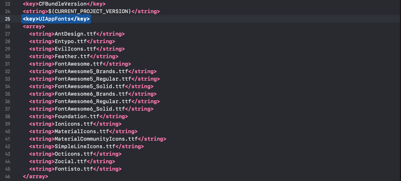
Next, copy the fonts below into your Info.plist.
<key>UIAppFonts</key>
<array>
  <string>AntDesign.ttf</string>
  <string>Entypo.ttf</string>
  <string>EvilIcons.ttf</string>
  <string>Feather.ttf</string>
  <string>FontAwesome.ttf</string>
  <string>FontAwesome5_Brands.ttf</string>
  <string>FontAwesome5_Regular.ttf</string>
  <string>FontAwesome5_Solid.ttf</string>
  <string>FontAwesome6_Brands.ttf</string>
  <string>FontAwesome6_Regular.ttf</string>
  <string>FontAwesome6_Solid.ttf</string>
  <string>Foundation.ttf</string>
  <string>Ionicons.ttf</string>
  <string>MaterialIcons.ttf</string>
  <string>MaterialCommunityIcons.ttf</string>
  <string>SimpleLineIcons.ttf</string>
  <string>Octicons.ttf</string>
  <string>Zocial.ttf</string>
  <string>Fontisto.ttf</string>
</array>
Note: You can only select the fonts you would like to use in your React Native Application.
After you added these fonts the Info.plist file should look like this:
Add
fonts.gradlefor Android.
Open android/app/build.gradle (NOT android/build.gradle) and add the following code to the bottom:
apply from: file("../../node_modules/react-native-vector-icons/fonts.gradle")
If you want to customize fonts, use:
project.ext.vectoricons = [
    iconFontNames: [ 'MaterialIcons.ttf', 'EvilIcons.ttf' ]
]

apply from: file("../../node_modules/react-native-vector-icons/fonts.gradle")
Original instructions can be found on Github: https://github.com/oblador/react-native-vector-icons