useWindowDimensions
The recommended way to get screen dimensions in React Native is using the useWindowDimensions hook. This hook automatically updates as the window's dimensions change, which works perfectly with React's component lifecycle.
import { View, Text, useWindowDimensions } from 'react-native';

export default function Example() {
  const { width, height } = useWindowDimensions();

  return (
    <View style={{ width: width, height: height / 2 }}>
      <Text>This view is full width and half height</Text>
    </View>
  );
}
The useWindowDimensions hook:
- Updates automatically on dimension changes (rotation, split-screen)
- Available in React Native 0.61.0 and above
- Returns both width and height in a single call
- Optimized for React components
Dimensions API (legacy)
For older versions of React Native or when you need more control, you can use the Dimensions API.
import { View, Text, Dimensions } from 'react-native';

// Get initial dimensions
const windowWidth = Dimensions.get('window').width;
const windowHeight = Dimensions.get('window').height;

// Listen for dimension changes
Dimensions.addEventListener('change', ({ window }) => {
  const { width, height } = window;
  // Update your UI here
});

export default function Example() {
  return (
    <View style={{ width: windowWidth, height: windowHeight / 2 }}>
      <Text>This view is full width and half height</Text>
    </View>
  );
}
Note: The Dimensions API is not recommended because it doesn't automatically update on screen rotation.
Common Use Cases
Responsive Layouts
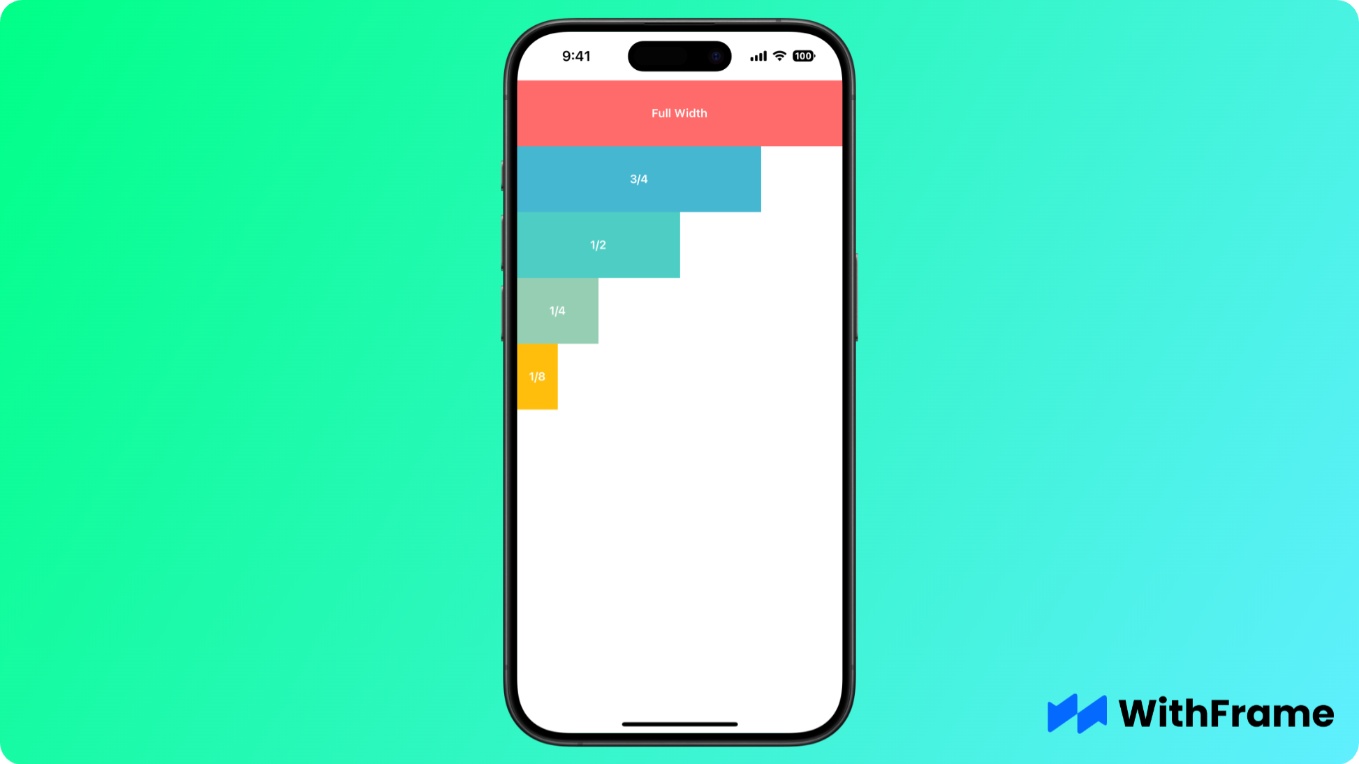
import { SafeAreaView, View, Text, useWindowDimensions } from 'react-native';

export default function ResponsiveWidths() {
  const { width } = useWindowDimensions();

  return (
    <SafeAreaView>
      <View
        style={{
          width: width,
          height: 80,
          backgroundColor: '#FF6B6B',
          justifyContent: 'center',
          alignItems: 'center',
        }}>
        <Text style={{ color: '#fff', fontWeight: '600' }}>Full Width</Text>
      </View>

      <View
        style={{
          width: width / 2,
          height: 80,
          backgroundColor: '#4ECDC4',
          justifyContent: 'center',
          alignItems: 'center',
        }}>
        <Text style={{ color: '#fff', fontWeight: '600' }}>1/2 Width</Text>
      </View>

      <View
        style={{
          width: width * 0.75,
          height: 80,
          backgroundColor: '#45B7D1',
          justifyContent: 'center',
          alignItems: 'center',
        }}>
        <Text style={{ color: '#fff', fontWeight: '600' }}>3/4 Width</Text>
      </View>

      <View
        style={{
          width: width / 4,
          height: 80,
          backgroundColor: '#96CEB4',
          justifyContent: 'center',
          alignItems: 'center',
        }}>
        <Text style={{ color: '#fff', fontWeight: '600' }}>1/4 Width</Text>
      </View>

      <View
        style={{
          width: width / 8,
          height: 80,
          backgroundColor: '#FFBE0B',
          justifyContent: 'center',
          alignItems: 'center',
        }}>
        <Text style={{ color: '#fff', fontWeight: '600' }}>1/8 Width</Text>
      </View>
    </SafeAreaView>
  );
}
Screen Change Detection
import { Dimensions } from 'react-native';
import { useEffect } from 'react';

export default function OrientationAware() {
  useEffect(() => {
    const subscription = Dimensions.addEventListener('change', ({ window }) => {
      const isPortrait = window.height > window.width;
      // Update layout based on orientation
    });

    return () => subscription.remove();
  }, []);

  return <View />;
}
Split Screen Components
import { View, Text, useWindowDimensions } from 'react-native';

export default function SplitScreen() {
  const { width } = useWindowDimensions();

  return (
    <View style={{ flexDirection: 'row' }}>
      <View style={{ width: width / 2 }}>
        <Text>Left half</Text>
      </View>
      <View style={{ width: width / 2 }}>
        <Text>Right half</Text>
      </View>
    </View>
  );
}
Dynamic Font Sizing
import { Text, useWindowDimensions } from 'react-native';

export default function ResponsiveText() {
  const { width } = useWindowDimensions();

  return (
    <Text style={{
      fontSize: width * 0.05, // 5% of screen width
      textAlign: 'center'
    }}>
      Text scales with screen width
    </Text>
  );
}
Best Practices
- Use
useWindowDimensionsfor React components - Don't store dimension values in state
- Calculate dimensions at render time
- Consider both portrait and landscape modes
- Test on different screen sizes
- Clean up dimension event listeners
- Be aware of platform differences:
- Android status bar
- Navigation bar height
- Safe areas on iOS