Intro
In React Native, a DatePicker component is used for creating an interface for selecting dates, much like the <input type="date" /> on the web.
Unfortunately, React Native had deprecated their DatePickerIOS and they recommend using one of the community packages instead.
In this tutorial, we will be using one of the most popular packages for implementing a date picker in a React Native application - react-native-ui-datepicker.
Prerequisites
To follow this tutorial, you will need a React Native application, which can be easily created using the following command:
npx react-native init DatePickerApp
For this example we will be using one of the WithFrame's Simple Date Picker components.
Installation
First, we need to install the react-native-ui-datepicker package in our React Native project directory. In addition, this dependency uses dayjs library which also needs to be installed.
Run the following command to install the package:
npm install react-native-ui-datepicker dayjs
or
yarn add react-native-ui-datepicker dayjs
Usage
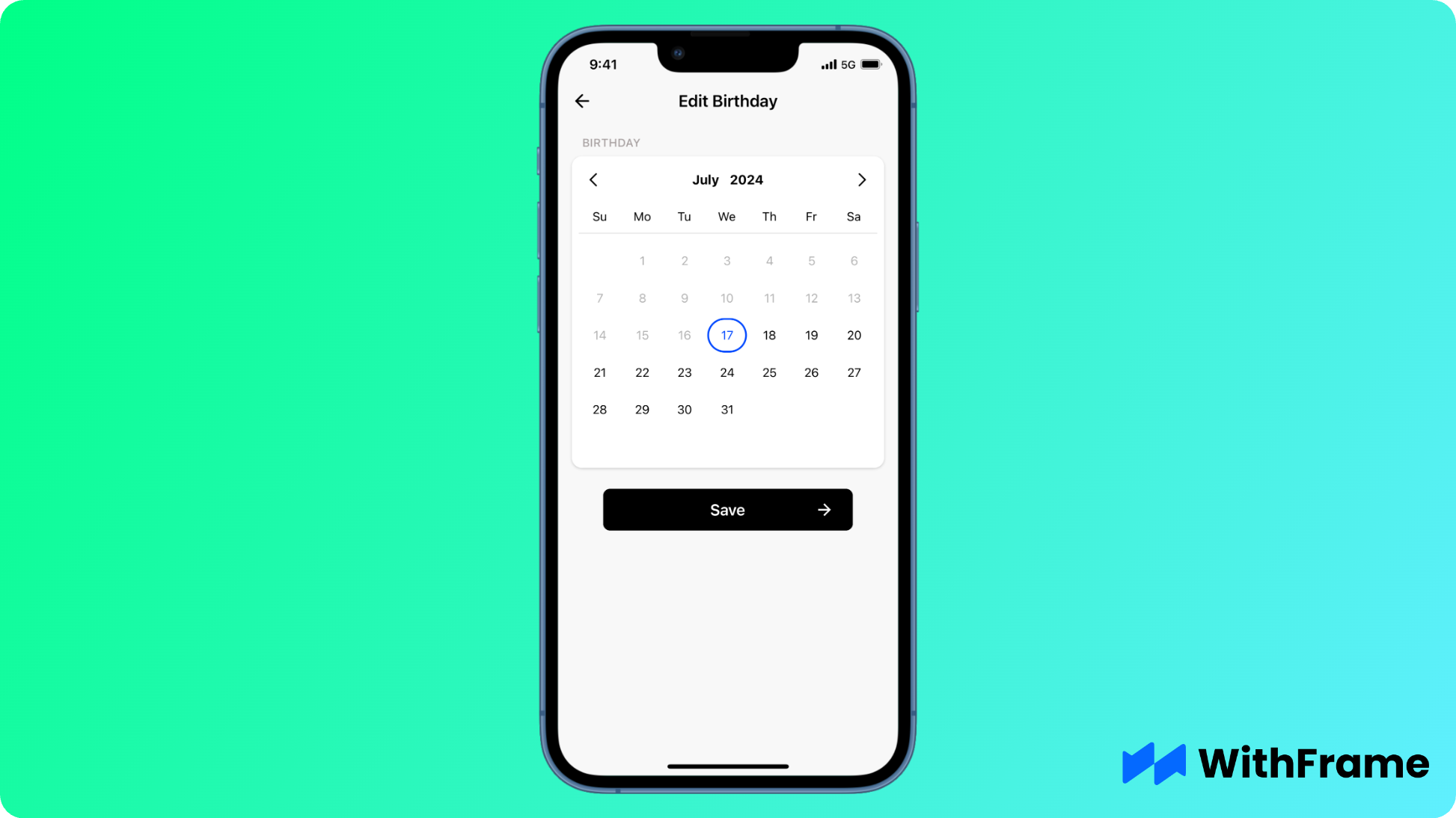
The DatePicker implementation is very straightforward, import default DatePicker component from the react-native-ui-datepicker package and render it in your application.
Next, use dayjs library to set the default date value.
import dayjs from 'dayjs';
import DatePicker from 'react-native-ui-datepicker';

export default function Example() {
  const [date, setDate] = useState(dayjs());

  return (
    <DatePicker
      mode="single"
      onChange={event => setDate(event.date)}
      date={date} />
  )
}
Setting Minimum and Maximum Dates
You can set the minimum and maximum selectable dates using the minDate and maxDate props. Dates outside of the these values will be disabled and grayed out.

<DatePicker
  mode="single"
  minDate={dayjs().subtract(7, 'days')}
  maxDate={dayjs().add(7, 'days')}
  onChange={event => setDate(event.date)}
  date={date}
/>
Selecting a Range of Dates
In some cases, you might want to allow users to select a range of dates instead of a single date.
You can enable this feature by changing the DatePicker mode to range.
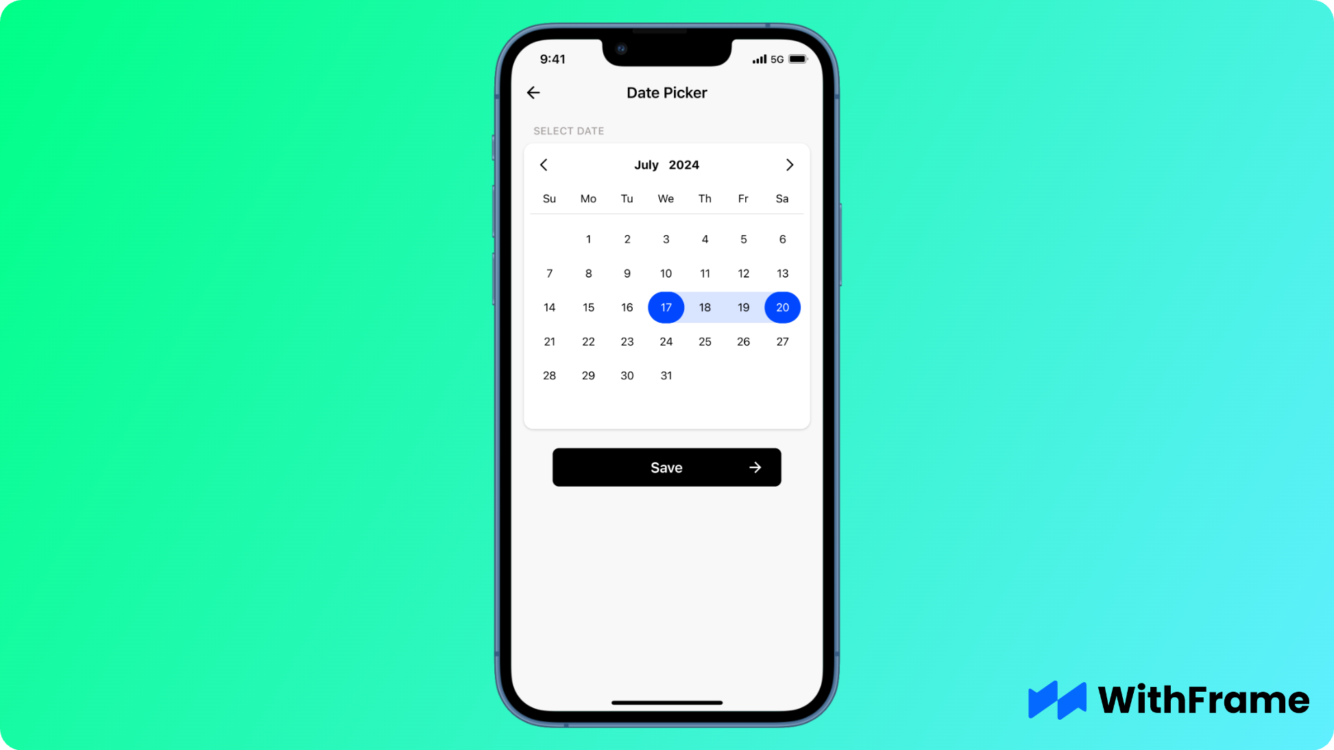
Note that you no longer need to provide date property, but instead you have to use startDate and endDate properties as shown below:
export default function Example() {
  const [dateRange, setDateRange] = useState({
    startDate: dayjs(),
    endDate: dayjs().add(3, 'days')
  });

  return (
    <DatePicker
      mode='range'
      startDate={dateRange.startDate}
      endDate={dateRange.endDate}
      onChange={event => setDateRange(event)}
    />
  )
}
Styling the Date Picker
You can style the DatePicker component using a variaty of style props similar to an example below. A full list of properties can be found here.
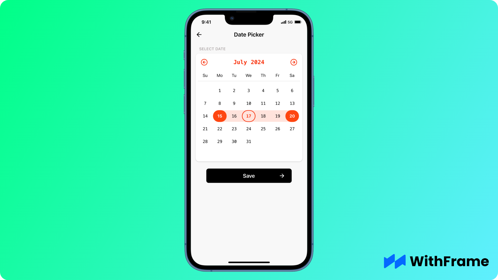
<DatePicker
  mode='range'
  startDate={dateRange.startDate}
  endDate={dateRange.endDate}
  onChange={event => setDateRange(event)}

  selectedTextStyle={{
    fontWeight: 'bold',
  }}
  selectedItemColor='#fe4611'
  todayContainerStyle={{
    borderColor: '#F82E08',
    borderWidth: 2,
  }}
  todayTextStyle={{
    color: '#F82E08',
    fontWeight: 'bold',
  }}
  calendarTextStyle={{
    fontFamily: 'Menlo-Regular',
  }}
  headerTextStyle={{
    fontSize: 19,
    color: '#F82E08',
    fontFamily: 'Menlo-Regular',
  }}
  buttonPrevIcon={
    <FeatherIcon name="arrow-left-circle" color="#F82E08" size={24} />
  }
  buttonNextIcon={
    <FeatherIcon name="arrow-right-circle" color="#F82E08" size={24} />
  }
/>
Bonus: Time Picker
This library also includes a Time Picker view in addition to the Date Picker. To enable it, simply set timePicker={true} on the DatePicker component.
Note: timePicker is only available in the single mode.

<DatePicker
  mode="single"
  date={date}
  onChange={event => setDate(event.date)}
  timePicker
/>
Conclusion
By following this tutorial, you can easily integrate and customize a DatePicker component into your own React Native application.