Intro
In React Native, a Picker component is used to create a user-friendly interface for choosing items from a set of options, similar to a select element on the web.
React Native once had a build-in Picker component, but it's now deprecated and not recommended for usage.
In this tutorial we will be using a very popular react-native-picker-select package which allows us to do this.
Prerequisites
To follow the post, you will need a React Native application, which can be easily created using this command:
npx react-native init PickerApp
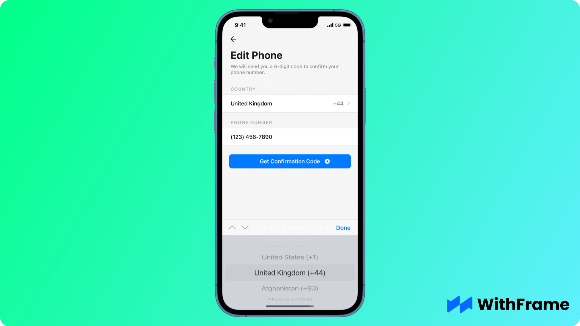
For this example we will be using one of the WithFrame's Phone Number Input with Country Picker.
Installation
First thing first, we have to install the react-native-picker-select package in React Native codebase or project directory.
Note that this package depends on @react-native-picker/picker, which is why we have to install it as well.
If you are using npm, run the following command:
npm install react-native-picker-select @react-native-picker/picker --save
Or, if you're using yarn, run the following command:
yarn add react-native-picker-select @react-native-picker/picker
If you are using Expo, install @react-native-picker/picker dependency using expo install as shown below:
expo install @react-native-picker/picker
Lastly, we have to link the native packages:
npx pod-install
In React Native 0.60+ the CLI autolink feature links the module while building the app.
Usage
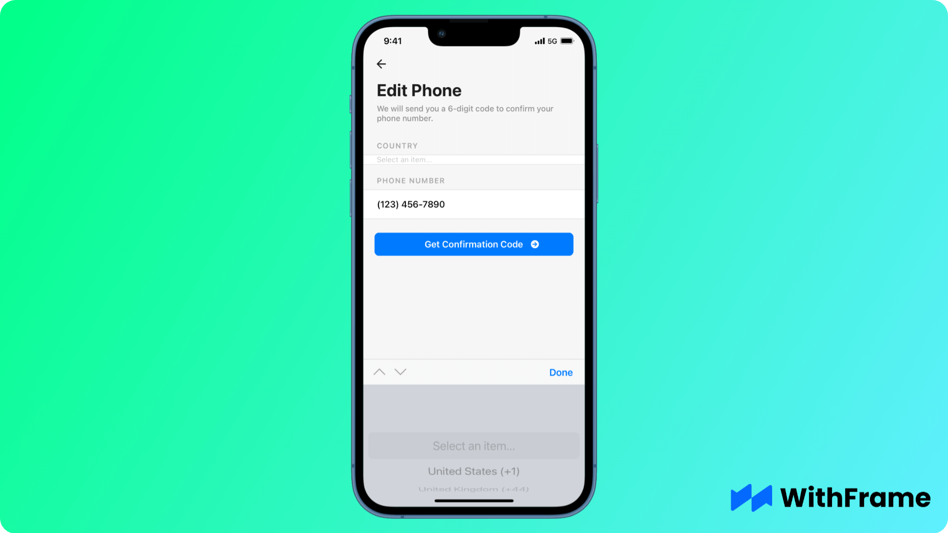
Now that you have successfully installed the React Native Picker package, you have to import the default RNPickerSelect component from the react-native-picker-select.
This component is responsible for rendering the select view in React Native and it only has 2 required props: items and onValueChange.
In addition to these, we will also pass a value property to display the selected option.
import React, { useState } from "react";
import { SafeAreaView, View, Text } from "react-native";
import RNPickerSelect from "react-native-picker-select";

const countries = [
  { id: "US", name: "United States", code: "+1" },
  { id: "GB", name: "United Kingdom", code: "+44" },

  // other countries
];

export default function Example() {
  const [form, setForm] = useState({
    country: "US",
    phone: "(123) 456-7890",
  });

  return (
    <SafeAreaView style={{ flex: 1, backgroundColor: "#f6f6f6" }}>
      ...
      <View style={styles.section}>
        <Text style={styles.sectionTitle}>Country</Text>

        <View style={styles.sectionBody}>
          <RNPickerSelect
            value={form.country}
            onValueChange={(country) => setForm({ ...form, country })}
            items={countries.map(({ id, name, code }) => ({
              label: `${name} (${code})`,
              value: id,
            }))}
          />
        </View>
      </View>
      ...
    </SafeAreaView>
  );
}
Customization
Now that we have a working picker in both iOS & Android, we can get to customizing and styling it.
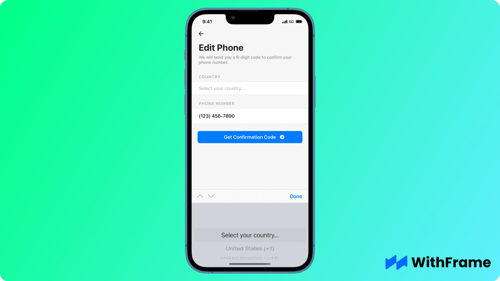
Using a custom placeholder
You can pass a custom placeholder option to replace the default "Select an item..." placeholder text.
In addition, you can use style property to style the picker.
<RNPickerSelect
  placeholder={{ label: "Select your country...", value: null }}
  style={{
    placeholder: { fontSize: 17, paddingVertical: 12, color: "#ababab" },
  }}
  value={form.country}
  onValueChange={(country) => setForm({ ...form, country })}
  items={countries.map(({ id, name, code }) => ({
    label: `${name} (${code})`,
    value: id,
  }))}
/>
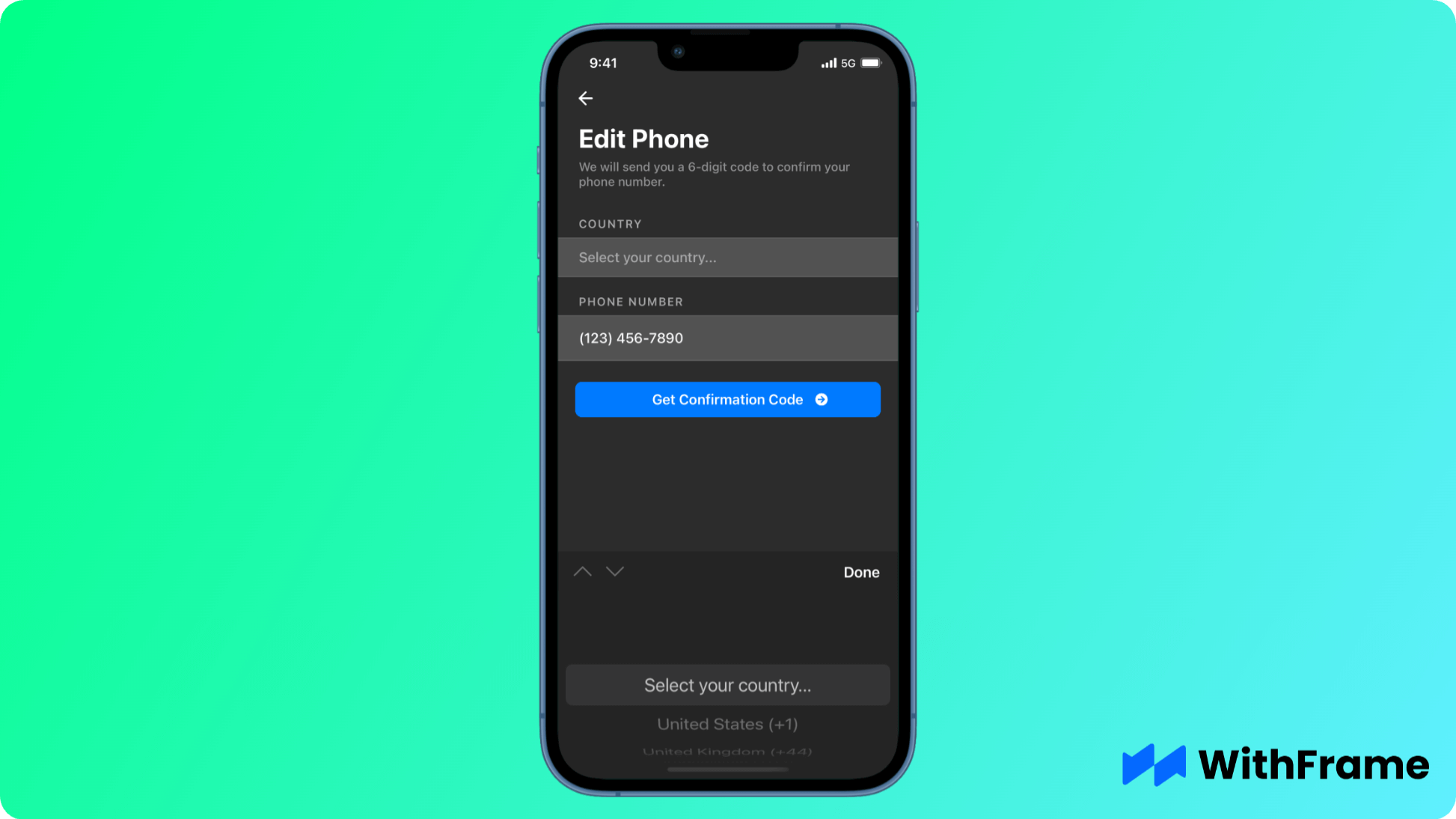
Picker in Dark Mode
Even though react-native-picker-select doesn't automatically autodetect the dark mode, you can manually pass darkTheme property to use it.
<RNPickerSelect
  darkTheme={true}
  // or darkTheme={Appearance.getColorScheme() === 'dark'} for dynamic usage

  value={form.country}
  onValueChange={(country) => setForm({ ...form, country })}
  items={countries.map(({ id, name, code }) => ({
    label: `${name} (${code})`,
    value: id,
  }))}
/>
Customizing Trigger Component
Lastly, for our component we want the picker trigger button to look similar to other inputs. In order to achieve this, we have to pass our own trigger component as a children.
Note that you don't have to wrap your trigger component into TouchableOpacity because RNPickerSelect already handles user gestures.
<RNPickerSelect
  value={form.country}
  onValueChange={(country) => setForm({ ...form, country })}
  items={countries.map(({ id, name, code }) => ({
    label: `${name} (${code})`,
    value: id,
  }))}
>
  <View style={styles.row}>
    <Text style={styles.rowLabel}>{country.name}</Text>

    <View style={styles.rowSpacer} />

    <Text style={styles.rowValue}>{country.code}</Text>

    <FeatherIcon color="#C6C6C6" name="chevron-right" size={20} />
  </View>
</RNPickerSelect>
Conclusion
The Picker component is a powerful and flexible tool for selecting options in a React Native application. It provides a simple interface for users to make selections from a list.
By following this tutorial, you can easily integrate the Picker component into your React Native application, improving both the user interface and user experience of your app.