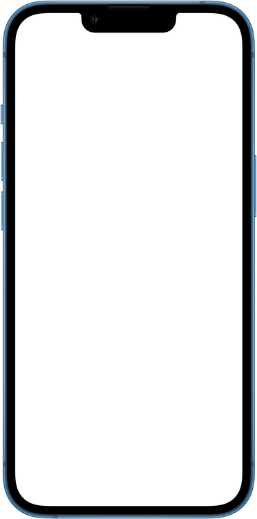
Subscription Paywall Screen with Image Background
Screen is created using these React Native Core Components: <StatusBar />, <SafeAreaView />, <Image />, <View />, <TouchableOpacity />, <Text />
import React from 'react';
import {
  StyleSheet,
  Dimensions,
  StatusBar,
  SafeAreaView,
  Image,
  View,
  TouchableOpacity,
  Text,
} from 'react-native';
import FeatherIcon from 'react-native-vector-icons/Feather';

const { width, height } = Dimensions.get('window');

export default function Example() {
  return (
    <SafeAreaView style={{ flex: 1 }}>
      <Image
        alt=""
        style={styles.background}
        source={{
          uri: 'https://images.unsplash.com/photo-1500916434205-0c77489c6cf7?ixlib=rb-4.0.3&ixid=MnwxMjA3fDB8MHxwaG90by1wYWdlfHx8fGVufDB8fHx8&auto=format&fit=crop&w=987&q=80',
        }} />

      <View style={[styles.background, styles.overflow]} />

      <View style={styles.container}>
        <StatusBar barStyle="light-content" />
        <View style={styles.paywall}>
          <TouchableOpacity
            onPress={() => {
              // handle onPress
            }}
            style={styles.paywallClose}>
            <FeatherIcon color="#fff" name="x" size={30} />
          </TouchableOpacity>

          <Text style={styles.paywallBadge}>Limited time offer</Text>

          <Text style={styles.paywallTitle}>NewsApp+</Text>

          <Text style={styles.paywallMessage}>
            Don't miss out on the full story. Unlock detailed reports, special
            features, and more by subscribing to our premium service.
          </Text>

          <TouchableOpacity
            onPress={() => {
              // handle onPress
            }}>
            <View style={styles.btn}>
              <Text style={styles.btnText}>Subscribe for $3.99 / mo</Text>
            </View>
          </TouchableOpacity>

          <View style={{ marginTop: 8 }}>
            <TouchableOpacity
              onPress={() => {
                // handle onPress
              }}>
              <View style={styles.btnSecondary}>
                <Text style={styles.btnSecondaryText}>Skip for now</Text>
              </View>
            </TouchableOpacity>
          </View>
        </View>
      </View>
    </SafeAreaView>
  );
}

const styles = StyleSheet.create({
  background: {
    position: 'absolute',
    top: 0,
    left: 0,
    width: width,
    height: height,
  },
  overflow: {
    backgroundColor: 'rgba(0, 0, 0, 0.6)',
  },
  container: {
    paddingVertical: 6,
    paddingHorizontal: 24,
    flexGrow: 1,
    flexShrink: 1,
    flexBasis: 0,
  },
  /** Paywall */
  paywall: {
    position: 'relative',
    flexDirection: 'column',
    alignItems: 'stretch',
    justifyContent: 'flex-end',
    flexGrow: 1,
    flexShrink: 1,
    flexBasis: 0,
  },
  paywallClose: {
    alignSelf: 'flex-end',
    marginBottom: 'auto',
  },
  paywallBadge: {
    fontSize: 15,
    color: '#fff',
    fontWeight: '700',
    marginBottom: 4,
    textAlign: 'center',
  },
  paywallTitle: {
    fontSize: 42,
    textAlign: 'center',
    lineHeight: 44,
    fontWeight: '700',
    color: '#fff',
    marginBottom: 12,
  },
  paywallMessage: {
    textAlign: 'center',
    marginBottom: 36,
    fontSize: 16,
    lineHeight: 22,
    fontWeight: '500',
    color: '#fff',
  },
  /** Button */
  btn: {
    flexDirection: 'row',
    alignItems: 'center',
    justifyContent: 'center',
    borderRadius: 8,
    paddingVertical: 10,
    paddingHorizontal: 20,
    borderWidth: 1,
    backgroundColor: '#fff',
    borderColor: '#fff',
  },
  btnText: {
    fontSize: 18,
    lineHeight: 26,
    fontWeight: '600',
    color: '#000',
  },
  btnSecondary: {
    flexDirection: 'row',
    alignItems: 'center',
    justifyContent: 'center',
    borderRadius: 8,
    paddingVertical: 10,
    paddingHorizontal: 20,
    borderWidth: 1,
    backgroundColor: 'transparent',
    borderColor: 'transparent',
  },
  btnSecondaryText: {
    fontSize: 18,
    lineHeight: 26,
    fontWeight: '600',
    color: '#fff',
  },
});
import React from 'react';
import {
StyleSheet,
Dimensions,
StatusBar,
SafeAreaView,
Image,
View,
TouchableOpacity,
Text,
} from 'react-native';
import FeatherIcon from '@expo/vector-icons/Feather';
const { width, height } = Dimensions.get('window');
export default function Example() {
return (
<SafeAreaView style={{ flex: 1 }}>
<Image
alt=""
style={styles.background}
source={{
uri: 'https://images.unsplash.com/photo-1500916434205-0c77489c6cf7?ixlib=rb-4.0.3&ixid=MnwxMjA3fDB8MHxwaG90by1wYWdlfHx8fGVufDB8fHx8&auto=format&fit=crop&w=987&q=80',
}} />
<View style={[styles.background, styles.overflow]} />
<View style={styles.container}>
<StatusBar barStyle="light-content" />
<View style={styles.paywall}>
<TouchableOpacity
onPress={() => {
// handle onPress
}}
style={styles.paywallClose}>
<FeatherIcon color="#fff" name="x" size={30} />
</TouchableOpacity>
<Text style={styles.paywallBadge}>Limited time offer</Text>
<Text style={styles.paywallTitle}>NewsApp+</Text>
<Text style={styles.paywallMessage}>
Don't miss out on the full story. Unlock detailed reports, special
features, and more by subscribing to our premium service.
</Text>
<TouchableOpacity
onPress={() => {
// handle onPress
}}>
<View style={styles.btn}>
<Text style={styles.btnText}>Subscribe for $3.99 / mo</Text>
</View>
</TouchableOpacity>
<View style={{ marginTop: 8 }}>
<TouchableOpacity
onPress={() => {
// handle onPress
}}>
<View style={styles.btnSecondary}>
<Text style={styles.btnSecondaryText}>Skip for now</Text>
</View>
</TouchableOpacity>
</View>
</View>
</View>
</SafeAreaView>
);
}
const styles = StyleSheet.create({
background: {
position: 'absolute',
top: 0,
left: 0,
width: width,
height: height,
},
overflow: {
backgroundColor: 'rgba(0, 0, 0, 0.6)',
},
container: {
paddingVertical: 6,
paddingHorizontal: 24,
flexGrow: 1,
flexShrink: 1,
flexBasis: 0,
},
/** Paywall */
paywall: {
position: 'relative',
flexDirection: 'column',
alignItems: 'stretch',
justifyContent: 'flex-end',
flexGrow: 1,
flexShrink: 1,
flexBasis: 0,
},
paywallClose: {
alignSelf: 'flex-end',
marginBottom: 'auto',
},
paywallBadge: {
fontSize: 15,
color: '#fff',
fontWeight: '700',
marginBottom: 4,
textAlign: 'center',
},
paywallTitle: {
fontSize: 42,
textAlign: 'center',
lineHeight: 44,
fontWeight: '700',
color: '#fff',
marginBottom: 12,
},
paywallMessage: {
textAlign: 'center',
marginBottom: 36,
fontSize: 16,
lineHeight: 22,
fontWeight: '500',
color: '#fff',
},
/** Button */
btn: {
flexDirection: 'row',
alignItems: 'center',
justifyContent: 'center',
borderRadius: 8,
paddingVertical: 10,
paddingHorizontal: 20,
borderWidth: 1,
backgroundColor: '#fff',
borderColor: '#fff',
},
btnText: {
fontSize: 18,
lineHeight: 26,
fontWeight: '600',
color: '#000',
},
btnSecondary: {
flexDirection: 'row',
alignItems: 'center',
justifyContent: 'center',
borderRadius: 8,
paddingVertical: 10,
paddingHorizontal: 20,
borderWidth: 1,
backgroundColor: 'transparent',
borderColor: 'transparent',
},
btnSecondaryText: {
fontSize: 18,
lineHeight: 26,
fontWeight: '600',
color: '#fff',
},
});In-App Purchase Integration 💰
UI/UX implementation of the React Native Component with In-App Purchase integration using the `react-native-iap` package and NodeJS (Express) server.
import React, { useCallback, useEffect, useRef, useState } from 'react';
import {
  StyleSheet,
  Dimensions,
  StatusBar,
  Alert,
  Platform,
  View,
  Text,
  TouchableOpacity,
  SafeAreaView,
  Image,
  ActivityIndicator,
} from 'react-native';
import axios from 'axios';
import {
  requestSubscription,
  getProducts,
  initConnection,
  purchaseUpdatedListener,
  purchaseErrorListener,
  flushFailedPurchasesCachedAsPendingAndroid,
  finishTransaction,
  getAvailablePurchases,
} from 'react-native-iap';
import FeatherIcon from 'react-native-vector-icons/Feather';

const { width, height } = Dimensions.get('window');

/**
 * Replace `sku` with your own value from the AppStoreConnect and PlayMarket Console
 */
const sku = Platform.select({
  ios: 'subscription__3_99',
  android: 'subscription__3_99',
});

export default function Example() {
  const [activePurchase, setActivePurchase] = useState();
  const [isLoading, setIsLoading] = useState(false);
  const [products, setProducts] = useState(null);
  const purchaseUpdateSubscription = useRef();
  const purchaseErrorSubscription = useRef();

  const getActiveSubscription = useCallback(async () => {
    try {
      setIsLoading(true);

      const purchases = await getAvailablePurchases({
        alsoPublishToEventListener: false,
        onlyIncludeActiveItems: true,
      });

      if (purchases.length) {
        setActivePurchase(purchases[0]);
      }
    } catch (err) {
      console.error(err);
    } finally {
      setIsLoading(false);
    }
  }, []);

  useEffect(() => {
    (async () => {
      try {
        await initConnection();

        await getActiveSubscription();

        // Make sure "ghost" pending payments are removed
        await flushFailedPurchasesCachedAsPendingAndroid().catch(() => {});

        purchaseUpdateSubscription.current = purchaseUpdatedListener(
          async purchase => {
            const receipt = purchase.transactionReceipt;

            if (receipt) {
              try {
                setIsLoading(true);

                const { data } = await axios.post(
                  'https://demo.withfra.me/verify-purchase',
                  {
                    receipt,
                    platform: Platform.OS,
                  },
                );

                if (data.success) {
                  await finishTransaction({ purchase, isConsumable: false });

                  Alert.alert('Success!', 'Thank you for your purchase!', [
                    { text: 'OK', onPress: () => getActiveSubscription() },
                  ]);
                }
              } catch (err) {
                const message =
                  err.response?.data?.message ??
                  err.message ??
                  'Something went wrong!';
                Alert.alert('Oops!', message);
              } finally {
                setIsLoading(false);
              }
            }
          },
        );

        purchaseErrorSubscription.current = purchaseErrorListener(error => {
          Alert.alert('Oops!', error.message);
        });

        const data = await getProducts({ skus: [sku] });
        setProducts(data);
      } catch (err) {
        const message =
          err.response?.data?.message ?? err.message ?? 'Something went wrong!';
        Alert.alert('Oops!', message);
      }
    })();

    return () => {
      // cleanup on component unmount
      purchaseUpdateSubscription.current?.remove();
      purchaseUpdateSubscription.current = null;

      purchaseErrorSubscription.current?.remove();
      purchaseErrorSubscription.current = null;
    };
  }, [getActiveSubscription]);

  const handleSubscribe = useCallback(async () => {
    try {
      await requestSubscription({ sku });
    } catch (err) {
      if (err.code !== 'E_USER_CANCELLED') {
        Alert.alert('Oops!', err.message);
      }
    }
  }, []);

  const loading = !products || isLoading;

  if (activePurchase) {
    return (
      <View style={styles.loggedIn}>
        <Text style={styles.loggedInTitle}>You're subscribed!</Text>

        <Text style={styles.loggedInText}>
          Transaction ID: {activePurchase.transactionId}
        </Text>
        <Text style={styles.loggedInText} numberOfLines={1}>
          Transaction Date:{' '}
          {new Date(activePurchase.transactionDate).toISOString()}
        </Text>
        <Text style={styles.loggedInText} numberOfLines={1}>
          Transaction Receipt: {activePurchase.transactionReceipt}
        </Text>

        <TouchableOpacity onPress={() => {}}>
          <Text style={styles.loggedInLink}>Log out</Text>
        </TouchableOpacity>
      </View>
    );
  }

  return (
    <>
      {loading && (
        <View style={styles.activityOverflow}>
          <ActivityIndicator size="large" color="#fff" />
        </View>
      )}

      <SafeAreaView style={{ flex: 1 }}>
        <Image
          alt=""
          style={styles.background}
          source={{
            uri: 'https://images.unsplash.com/photo-1500916434205-0c77489c6cf7?ixlib=rb-4.0.3&ixid=MnwxMjA3fDB8MHxwaG90by1wYWdlfHx8fGVufDB8fHx8&auto=format&fit=crop&w=987&q=80',
          }} />

        <View style={[styles.background, styles.overflow]} />

        <View style={styles.container}>
          <StatusBar barStyle="light-content" />
          <View style={styles.paywall}>
            <TouchableOpacity
              onPress={() => {
                // handle onPress
              }}
              style={styles.paywallClose}>
              <FeatherIcon color="#fff" name="x" size={30} />
            </TouchableOpacity>

            <Text style={styles.paywallBadge}>Limited time offer</Text>

            <Text style={styles.paywallTitle}>NewsApp+</Text>

            <Text style={styles.paywallMessage}>
              Don't miss out on the full story. Unlock detailed reports, special
              features, and more by subscribing to our premium service.
            </Text>

            <TouchableOpacity onPress={handleSubscribe}>
              <View style={styles.btn}>
                <Text style={styles.btnText}>Subscribe for $3.99 / mo</Text>
              </View>
            </TouchableOpacity>

            <View style={{ marginTop: 8 }}>
              <TouchableOpacity
                onPress={() => {
                  // handle onPress
                }}>
                <View style={styles.btnSecondary}>
                  <Text style={styles.btnSecondaryText}>Skip for now</Text>
                </View>
              </TouchableOpacity>
            </View>
          </View>
        </View>
      </SafeAreaView>
    </>
  );
}

const styles = StyleSheet.create({
  activityOverflow: {
    position: 'absolute',
    top: 0,
    bottom: 0,
    right: 0,
    left: 0,
    zIndex: 9999,
    backgroundColor: 'rgba(0, 0, 0, 0.35)',
    alignItems: 'center',
    justifyContent: 'center',
    paddingBottom: 60,
  },
  background: {
    position: 'absolute',
    top: 0,
    left: 0,
    width: width,
    height: height,
  },
  overflow: {
    backgroundColor: 'rgba(0, 0, 0, 0.6)',
  },
  container: {
    paddingVertical: 6,
    paddingHorizontal: 24,
    flexGrow: 1,
    flexShrink: 1,
    flexBasis: 0,
  },
  loggedIn: {
    flex: 1,
    alignItems: 'center',
    justifyContent: 'center',
    paddingHorizontal: 24,
  },
  loggedInTitle: {
    fontSize: 17,
    fontWeight: '500',
    color: '#1d1d1d',
    marginBottom: 6,
  },
  loggedInText: {
    fontSize: 15,
    color: '#555',
  },
  loggedInLink: {
    fontSize: 15,
    color: '#007aff',
    textDecorationLine: 'underline',
  },
  /** Paywall */
  paywall: {
    position: 'relative',
    flexDirection: 'column',
    alignItems: 'stretch',
    justifyContent: 'flex-end',
    flexGrow: 1,
    flexShrink: 1,
    flexBasis: 0,
  },
  paywallClose: {
    alignSelf: 'flex-end',
    marginBottom: 'auto',
  },
  paywallBadge: {
    fontSize: 15,
    color: '#fff',
    fontWeight: '700',
    marginBottom: 4,
    textAlign: 'center',
  },
  paywallTitle: {
    fontSize: 42,
    textAlign: 'center',
    lineHeight: 44,
    fontWeight: '700',
    color: '#fff',
    marginBottom: 12,
  },
  paywallMessage: {
    textAlign: 'center',
    marginBottom: 36,
    fontSize: 16,
    lineHeight: 22,
    fontWeight: '500',
    color: '#fff',
  },
  /** Button */
  btn: {
    flexDirection: 'row',
    alignItems: 'center',
    justifyContent: 'center',
    borderRadius: 8,
    paddingVertical: 10,
    paddingHorizontal: 20,
    borderWidth: 1,
    backgroundColor: '#fff',
    borderColor: '#fff',
  },
  btnText: {
    fontSize: 18,
    lineHeight: 26,
    fontWeight: '600',
    color: '#000',
  },
  btnSecondary: {
    flexDirection: 'row',
    alignItems: 'center',
    justifyContent: 'center',
    borderRadius: 8,
    paddingVertical: 10,
    paddingHorizontal: 20,
    borderWidth: 1,
    backgroundColor: 'transparent',
    borderColor: 'transparent',
  },
  btnSecondaryText: {
    fontSize: 18,
    lineHeight: 26,
    fontWeight: '600',
    color: '#fff',
  },
});
import React, { useCallback, useEffect, useRef, useState } from 'react';
import {
StyleSheet,
Dimensions,
StatusBar,
Alert,
Platform,
View,
Text,
TouchableOpacity,
SafeAreaView,
Image,
ActivityIndicator,
} from 'react-native';
import axios from 'axios';
import {
requestSubscription,
getProducts,
initConnection,
purchaseUpdatedListener,
purchaseErrorListener,
flushFailedPurchasesCachedAsPendingAndroid,
finishTransaction,
getAvailablePurchases,
} from 'react-native-iap';
import FeatherIcon from '@expo/vector-icons/Feather';
const { width, height } = Dimensions.get('window');
/**
* Replace `sku` with your own value from the AppStoreConnect and PlayMarket Console
*/
const sku = Platform.select({
ios: 'subscription__3_99',
android: 'subscription__3_99',
});
export default function Example() {
const [activePurchase, setActivePurchase] = useState();
const [isLoading, setIsLoading] = useState(false);
const [products, setProducts] = useState(null);
const purchaseUpdateSubscription = useRef();
const purchaseErrorSubscription = useRef();
const getActiveSubscription = useCallback(async () => {
try {
setIsLoading(true);
const purchases = await getAvailablePurchases({
alsoPublishToEventListener: false,
onlyIncludeActiveItems: true,
});
if (purchases.length) {
setActivePurchase(purchases[0]);
}
} catch (err) {
console.error(err);
} finally {
setIsLoading(false);
}
}, []);
useEffect(() => {
(async () => {
try {
await initConnection();
await getActiveSubscription();
// Make sure "ghost" pending payments are removed
await flushFailedPurchasesCachedAsPendingAndroid().catch(() => {});
purchaseUpdateSubscription.current = purchaseUpdatedListener(
async purchase => {
const receipt = purchase.transactionReceipt;
if (receipt) {
try {
setIsLoading(true);
const { data } = await axios.post(
'https://demo.withfra.me/verify-purchase',
{
receipt,
platform: Platform.OS,
},
);
if (data.success) {
await finishTransaction({ purchase, isConsumable: false });
Alert.alert('Success!', 'Thank you for your purchase!', [
{ text: 'OK', onPress: () => getActiveSubscription() },
]);
}
} catch (err) {
const message =
err.response?.data?.message ??
err.message ??
'Something went wrong!';
Alert.alert('Oops!', message);
} finally {
setIsLoading(false);
}
}
},
);
purchaseErrorSubscription.current = purchaseErrorListener(error => {
Alert.alert('Oops!', error.message);
});
const data = await getProducts({ skus: [sku] });
setProducts(data);
} catch (err) {
const message =
err.response?.data?.message ?? err.message ?? 'Something went wrong!';
Alert.alert('Oops!', message);
}
})();
return () => {
// cleanup on component unmount
purchaseUpdateSubscription.current?.remove();
purchaseUpdateSubscription.current = null;
purchaseErrorSubscription.current?.remove();
purchaseErrorSubscription.current = null;
};
}, [getActiveSubscription]);
const handleSubscribe = useCallback(async () => {
try {
await requestSubscription({ sku });
} catch (err) {
if (err.code !== 'E_USER_CANCELLED') {
Alert.alert('Oops!', err.message);
}
}
}, []);
const loading = !products || isLoading;
if (activePurchase) {
return (
<View style={styles.loggedIn}>
<Text style={styles.loggedInTitle}>You're subscribed!</Text>
<Text style={styles.loggedInText}>
Transaction ID: {activePurchase.transactionId}
</Text>
<Text style={styles.loggedInText} numberOfLines={1}>
Transaction Date:{' '}
{new Date(activePurchase.transactionDate).toISOString()}
</Text>
<Text style={styles.loggedInText} numberOfLines={1}>
Transaction Receipt: {activePurchase.transactionReceipt}
</Text>
<TouchableOpacity onPress={() => {}}>
<Text style={styles.loggedInLink}>Log out</Text>
</TouchableOpacity>
</View>
);
}
return (
<>
{loading && (
<View style={styles.activityOverflow}>
<ActivityIndicator size="large" color="#fff" />
</View>
)}
<SafeAreaView style={{ flex: 1 }}>
<Image
alt=""
style={styles.background}
source={{
uri: 'https://images.unsplash.com/photo-1500916434205-0c77489c6cf7?ixlib=rb-4.0.3&ixid=MnwxMjA3fDB8MHxwaG90by1wYWdlfHx8fGVufDB8fHx8&auto=format&fit=crop&w=987&q=80',
}} />
<View style={[styles.background, styles.overflow]} />
<View style={styles.container}>
<StatusBar barStyle="light-content" />
<View style={styles.paywall}>
<TouchableOpacity
onPress={() => {
// handle onPress
}}
style={styles.paywallClose}>
<FeatherIcon color="#fff" name="x" size={30} />
</TouchableOpacity>
<Text style={styles.paywallBadge}>Limited time offer</Text>
<Text style={styles.paywallTitle}>NewsApp+</Text>
<Text style={styles.paywallMessage}>
Don't miss out on the full story. Unlock detailed reports, special
features, and more by subscribing to our premium service.
</Text>
<TouchableOpacity onPress={handleSubscribe}>
<View style={styles.btn}>
<Text style={styles.btnText}>Subscribe for $3.99 / mo</Text>
</View>
</TouchableOpacity>
<View style={{ marginTop: 8 }}>
<TouchableOpacity
onPress={() => {
// handle onPress
}}>
<View style={styles.btnSecondary}>
<Text style={styles.btnSecondaryText}>Skip for now</Text>
</View>
</TouchableOpacity>
</View>
</View>
</View>
</SafeAreaView>
</>
);
}
const styles = StyleSheet.create({
activityOverflow: {
position: 'absolute',
top: 0,
bottom: 0,
right: 0,
left: 0,
zIndex: 9999,
backgroundColor: 'rgba(0, 0, 0, 0.35)',
alignItems: 'center',
justifyContent: 'center',
paddingBottom: 60,
},
background: {
position: 'absolute',
top: 0,
left: 0,
width: width,
height: height,
},
overflow: {
backgroundColor: 'rgba(0, 0, 0, 0.6)',
},
container: {
paddingVertical: 6,
paddingHorizontal: 24,
flexGrow: 1,
flexShrink: 1,
flexBasis: 0,
},
loggedIn: {
flex: 1,
alignItems: 'center',
justifyContent: 'center',
paddingHorizontal: 24,
},
loggedInTitle: {
fontSize: 17,
fontWeight: '500',
color: '#1d1d1d',
marginBottom: 6,
},
loggedInText: {
fontSize: 15,
color: '#555',
},
loggedInLink: {
fontSize: 15,
color: '#007aff',
textDecorationLine: 'underline',
},
/** Paywall */
paywall: {
position: 'relative',
flexDirection: 'column',
alignItems: 'stretch',
justifyContent: 'flex-end',
flexGrow: 1,
flexShrink: 1,
flexBasis: 0,
},
paywallClose: {
alignSelf: 'flex-end',
marginBottom: 'auto',
},
paywallBadge: {
fontSize: 15,
color: '#fff',
fontWeight: '700',
marginBottom: 4,
textAlign: 'center',
},
paywallTitle: {
fontSize: 42,
textAlign: 'center',
lineHeight: 44,
fontWeight: '700',
color: '#fff',
marginBottom: 12,
},
paywallMessage: {
textAlign: 'center',
marginBottom: 36,
fontSize: 16,
lineHeight: 22,
fontWeight: '500',
color: '#fff',
},
/** Button */
btn: {
flexDirection: 'row',
alignItems: 'center',
justifyContent: 'center',
borderRadius: 8,
paddingVertical: 10,
paddingHorizontal: 20,
borderWidth: 1,
backgroundColor: '#fff',
borderColor: '#fff',
},
btnText: {
fontSize: 18,
lineHeight: 26,
fontWeight: '600',
color: '#000',
},
btnSecondary: {
flexDirection: 'row',
alignItems: 'center',
justifyContent: 'center',
borderRadius: 8,
paddingVertical: 10,
paddingHorizontal: 20,
borderWidth: 1,
backgroundColor: 'transparent',
borderColor: 'transparent',
},
btnSecondaryText: {
fontSize: 18,
lineHeight: 26,
fontWeight: '600',
color: '#fff',
},
});const express = require('express');
const axios = require('axios');
const {google} = require('googleapis');
const app = express();
app.use(express.json());
/**
* For demo purchases we will always approve receipts without checking with Google / Apple.
*
* Note: Make sure to remove this flag in your production code!
*/
const IS_DEVELOPMENT = true;
/**
* APPLE
*
* Follow this guide to generate your secret key:
* https://developer.apple.com/help/app-store-connect/configure-in-app-purchase-settings/generate-a-shared-secret-to-verify-receipts
*/
const ITUNES_PASSWORD = 'YOUR_ITUNES_PASSWORD';
const verifyTransactionWithItunes = async (receipt) => {
try {
const {data: production} = await axios.post('https://buy.itunes.apple.com/verifyReceipt', {
'receipt-data': receipt,
password: ITUNES_PASSWORD,
})
// successful transaction
if (production.status === 0) {
return true;
}
// According to Apple, status `21007` is returned when the purchase is made in the sandbox envorinment.
if (production.status === 21007) {
const {data: sandbox} = await axios.post('https://sandbox.itunes.apple.com/verifyReceipt', {
'receipt-data': receipt,
password: ITUNES_PASSWORD,
})
// successful transaction
if (sandbox.status === 0) {
return true;
}
}
} catch (err) {
console.error(err);
}
return false;
}
/**
* GOOGLE
*
* Obtain `CLIENT_EMAIL` and `PRIVATE_KEY` values from the service account JSON file.
*/
const CLIENT_EMAIL = 'YOUR_CLIENT_EMAIL'
const PRIVATE_KEY = 'YOUR_PRIVATE_KEY'
const PACKAGE_NAME = 'YOUR_APP_PACKAGE_NAME';
const PRODUCT_ID = 'YOUR_PRODUCT_ID'
const auth = new google.auth.JWT(
CLIENT_EMAIL,
null,
PRIVATE_KEY,
['https://www.googleapis.com/auth/androidpublisher']
)
const androidApi = google.androidpublisher({
version: 'v3',
auth,
});
const verifyTransactionWithPlayMarket = async (receipt) => {
try{
const { purchaseToken } = JSON.parse(receipt)
await androidApi.purchases.products.acknowledge({
packageName: PACKAGE_NAME,
productId: PRODUCT_ID,
token: purchaseToken
})
return true
} catch(err) {
console.error(err)
}
return false;
}
app.post('/verify-purchase', async (req, res) => {
const {receipt, platform} = req.body;
if (!receipt) {
return res.status(400).json({ success: false, message: '`receipt` is required.' });
}
if (!['ios', 'android'].includes(platform)) {
return res.status(400).json({ success: false, message: '`platform` has to be either `ios` or `android`.' });
}
// For demo purchases we will always approve receipts without checking with Google / Apple.
if (!IS_DEVELOPMENT) {
const verifiedPurchase = platform === 'ios'
? await verifyTransactionWithItunes(receipt)
: await verifyTransactionWithPlayMarket(receipt);
if (!verifiedPurchase) {
return res.status(400).json({ success: false, message: 'Looks like we could not verify your purchase, please try again.' });
}
}
// Purchase is successful, update user's entity to reflect it or deliver items the user has paid for..
await new Promise(resolve => setTimeout(resolve, 4000))
return res.json({ success: true });
})
app.listen(4242, () => {
console.log('Express server is running on port 4242.');
})Dependencies
Before getting started, make sure you have all the necessary dependencies for this component. Follow the steps below to install any missing dependencies.
Install the package.
npm install --save react-native-vector-icons
Link the native packages for iOS.
npx pod-install
In React Native 0.60+ the CLI autolink feature links the module while building the app.
Add Fonts to the
Info.plistfile.
Open your XCode project, right click on the Info.plist, and select Open As -> Source Code.
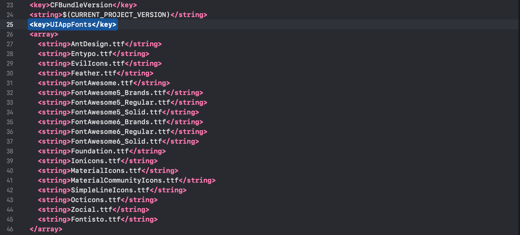
Next, copy the fonts below into your Info.plist.
<key>UIAppFonts</key>
<array>
  <string>AntDesign.ttf</string>
  <string>Entypo.ttf</string>
  <string>EvilIcons.ttf</string>
  <string>Feather.ttf</string>
  <string>FontAwesome.ttf</string>
  <string>FontAwesome5_Brands.ttf</string>
  <string>FontAwesome5_Regular.ttf</string>
  <string>FontAwesome5_Solid.ttf</string>
  <string>FontAwesome6_Brands.ttf</string>
  <string>FontAwesome6_Regular.ttf</string>
  <string>FontAwesome6_Solid.ttf</string>
  <string>Foundation.ttf</string>
  <string>Ionicons.ttf</string>
  <string>MaterialIcons.ttf</string>
  <string>MaterialCommunityIcons.ttf</string>
  <string>SimpleLineIcons.ttf</string>
  <string>Octicons.ttf</string>
  <string>Zocial.ttf</string>
  <string>Fontisto.ttf</string>
</array>
Note: You can only select the fonts you would like to use in your React Native Application.
After you added these fonts the Info.plist file should look like this:
Add
fonts.gradlefor Android.
Open android/app/build.gradle (NOT android/build.gradle) and add the following code to the bottom:
apply from: file("../../node_modules/react-native-vector-icons/fonts.gradle")
If you want to customize fonts, use:
project.ext.vectoricons = [
    iconFontNames: [ 'MaterialIcons.ttf', 'EvilIcons.ttf' ]
]

apply from: file("../../node_modules/react-native-vector-icons/fonts.gradle")
Original instructions can be found on Github: https://github.com/oblador/react-native-vector-icons