Messages Screen with Circular Avatars and Preview Message
Screen is created using these React Native Core Components: <SafeAreaView />, <ScrollView />, <View />, <TouchableOpacity />, <Image />, <Text />
import React from 'react';
import {
  StyleSheet,
  SafeAreaView,
  ScrollView,
  View,
  TouchableOpacity,
  Image,
  Text,
} from 'react-native';
import FeatherIcon from 'react-native-vector-icons/Feather';

const items = [


  {
    img: 'https://images.unsplash.com/photo-1633332755192-727a05c4013d?ixlib=rb-1.2.1&ixid=MnwxMjA3fDB8MHxwaG90by1wYWdlfHx8fGVufDB8fHx8&auto=format&fit=facearea&facepad=2.5&w=256&h=256&q=80',
    name: 'Nick Miller',
    message: 'Looking forward to our collaboration!',
  },
  {
    img: 'https://images.unsplash.com/photo-1489424731084-a5d8b219a5bb?ixlib=rb-4.0.3&ixid=MnwxMjA3fDB8MHxwaG90by1wYWdlfHx8fGVufDB8fHx8&auto=format&fit=crop&w=987&q=80',
    name: 'Ashley',
    message: 'Amazing!! 🔥🔥🔥',
  },
  {
    img: 'https://images.unsplash.com/photo-1507591064344-4c6ce005b128?ixlib=rb-4.0.3&ixid=MnwxMjA3fDB8MHxwaG90by1wYWdlfHx8fGVufDB8fHx8&auto=format&fit=crop&w=2340&q=80',
    name: 'Max',
    message: 'Appreciate the opportunity to connect and share insights.',
  },
  {
    img: 'https://images.unsplash.com/photo-1573496359142-b8d87734a5a2?ixlib=rb-4.0.3&ixid=MnwxMjA3fDB8MHxwaG90by1wYWdlfHx8fGVufDB8fHx8&auto=format&fit=crop&w=988&q=80',
    name: 'Schmidt',
    message: "Let's bring creativity to the forefront of our discussions.",
  },
  {
    img: 'https://images.unsplash.com/photo-1553240799-36bbf332a5c3?ixlib=rb-4.0.3&ixid=MnwxMjA3fDB8MHxwaG90by1wYWdlfHx8fGVufDB8fHx8&auto=format&fit=crop&w=2340&q=80',
    name: 'Dwight',
    message: 'Excited to explore opportunities for collaboration.',
  },
  {
    img: 'https://images.unsplash.com/photo-1573497019236-17f8177b81e8?ixlib=rb-4.0.3&ixid=MnwxMjA3fDB8MHxwaG90by1wYWdlfHx8fGVufDB8fHx8&auto=format&fit=crop&w=2340&q=80',
    name: 'Amy',
    message: 'Eager to contribute and make a positive impact.',
  },
];

items.push(...items);

export default function Example() {
  return (
    <SafeAreaView style={{ flex: 1, backgroundColor: '#fff' }}>
      <View style={styles.header}>
        <View style={styles.headerTop}>
          <View style={styles.headerAction} />

          <View style={styles.headerAction}>
            <TouchableOpacity
              onPress={() => {
                // handle onPress
              }}>
              <FeatherIcon
                color="#266EF1"
                name="edit"
                size={21} />
            </TouchableOpacity>
          </View>
        </View>

        <Text style={styles.headerTitle}>Messages</Text>
      </View>

      <ScrollView>
        {items.map(({ name, message, img }, index) => {
          return (
            <View key={index} style={styles.cardWrapper}>
              <TouchableOpacity
                onPress={() => {
                  // handle onPress
                }}
                style={styles.card}>
                <Image
                  alt=""
                  resizeMode="cover"
                  source={{ uri: img }}
                  style={styles.cardImg} />

                <View style={styles.cardBody}>
                  <Text style={styles.cardTitle}>{name}</Text>

                  <Text
                    ellipsizeMode="tail"
                    numberOfLines={1}
                    style={styles.cardContent}>
                    {message}
                  </Text>
                </View>

                <View style={styles.cardIcon}>
                  <FeatherIcon
                    color="#ccc"
                    name="chevron-right"
                    size={20} />
                </View>
              </TouchableOpacity>
            </View>
          );
        })}
      </ScrollView>
    </SafeAreaView>
  );
}

const styles = StyleSheet.create({
  /** Header */
  header: {
    paddingHorizontal: 16,
    marginBottom: 12,
  },
  headerTop: {
    marginHorizontal: -6,
    flexDirection: 'row',
    alignItems: 'center',
    justifyContent: 'space-between',
  },
  headerAction: {
    width: 40,
    height: 40,
    alignItems: 'center',
    justifyContent: 'center',
  },
  headerTitle: {
    fontSize: 35,
    fontWeight: '700',
    color: '#1d1d1d',
  },
  /** Card */
  card: {
    height: 66,
    paddingRight: 12,
    flexDirection: 'row',
    alignItems: 'center',
    justifyContent: 'flex-start',
  },
  cardWrapper: {
    borderBottomWidth: 1,
    borderColor: '#DFDFE0',
    marginLeft: 16,
  },
  cardImg: {
    width: 48,
    height: 48,
    borderRadius: 9999,
    marginRight: 12,
  },
  cardBody: {
    maxWidth: '100%',
    flexGrow: 1,
    flexShrink: 1,
    flexBasis: 0,
  },
  cardTitle: {
    fontSize: 17,
    fontWeight: '700',
    color: '#1d1d1d',
  },
  cardContent: {
    fontSize: 15,
    fontWeight: '500',
    color: '#737987',
    lineHeight: 20,
    marginTop: 4,
  },
  cardIcon: {
    alignSelf: 'flex-start',
    paddingVertical: 14,
    paddingHorizontal: 4,
  },
});
import React from 'react';
import {
StyleSheet,
SafeAreaView,
ScrollView,
View,
TouchableOpacity,
Image,
Text,
} from 'react-native';
import FeatherIcon from '@expo/vector-icons/Feather';
const items = [
{
img: 'https://images.unsplash.com/photo-1633332755192-727a05c4013d?ixlib=rb-1.2.1&ixid=MnwxMjA3fDB8MHxwaG90by1wYWdlfHx8fGVufDB8fHx8&auto=format&fit=facearea&facepad=2.5&w=256&h=256&q=80',
name: 'Nick Miller',
message: 'Looking forward to our collaboration!',
},
{
img: 'https://images.unsplash.com/photo-1489424731084-a5d8b219a5bb?ixlib=rb-4.0.3&ixid=MnwxMjA3fDB8MHxwaG90by1wYWdlfHx8fGVufDB8fHx8&auto=format&fit=crop&w=987&q=80',
name: 'Ashley',
message: 'Amazing!! 🔥🔥🔥',
},
{
img: 'https://images.unsplash.com/photo-1507591064344-4c6ce005b128?ixlib=rb-4.0.3&ixid=MnwxMjA3fDB8MHxwaG90by1wYWdlfHx8fGVufDB8fHx8&auto=format&fit=crop&w=2340&q=80',
name: 'Max',
message: 'Appreciate the opportunity to connect and share insights.',
},
{
img: 'https://images.unsplash.com/photo-1573496359142-b8d87734a5a2?ixlib=rb-4.0.3&ixid=MnwxMjA3fDB8MHxwaG90by1wYWdlfHx8fGVufDB8fHx8&auto=format&fit=crop&w=988&q=80',
name: 'Schmidt',
message: "Let's bring creativity to the forefront of our discussions.",
},
{
img: 'https://images.unsplash.com/photo-1553240799-36bbf332a5c3?ixlib=rb-4.0.3&ixid=MnwxMjA3fDB8MHxwaG90by1wYWdlfHx8fGVufDB8fHx8&auto=format&fit=crop&w=2340&q=80',
name: 'Dwight',
message: 'Excited to explore opportunities for collaboration.',
},
{
img: 'https://images.unsplash.com/photo-1573497019236-17f8177b81e8?ixlib=rb-4.0.3&ixid=MnwxMjA3fDB8MHxwaG90by1wYWdlfHx8fGVufDB8fHx8&auto=format&fit=crop&w=2340&q=80',
name: 'Amy',
message: 'Eager to contribute and make a positive impact.',
},
];
items.push(...items);
export default function Example() {
return (
<SafeAreaView style={{ flex: 1, backgroundColor: '#fff' }}>
<View style={styles.header}>
<View style={styles.headerTop}>
<View style={styles.headerAction} />
<View style={styles.headerAction}>
<TouchableOpacity
onPress={() => {
// handle onPress
}}>
<FeatherIcon
color="#266EF1"
name="edit"
size={21} />
</TouchableOpacity>
</View>
</View>
<Text style={styles.headerTitle}>Messages</Text>
</View>
<ScrollView>
{items.map(({ name, message, img }, index) => {
return (
<View key={index} style={styles.cardWrapper}>
<TouchableOpacity
onPress={() => {
// handle onPress
}}
style={styles.card}>
<Image
alt=""
resizeMode="cover"
source={{ uri: img }}
style={styles.cardImg} />
<View style={styles.cardBody}>
<Text style={styles.cardTitle}>{name}</Text>
<Text
ellipsizeMode="tail"
numberOfLines={1}
style={styles.cardContent}>
{message}
</Text>
</View>
<View style={styles.cardIcon}>
<FeatherIcon
color="#ccc"
name="chevron-right"
size={20} />
</View>
</TouchableOpacity>
</View>
);
})}
</ScrollView>
</SafeAreaView>
);
}
const styles = StyleSheet.create({
/** Header */
header: {
paddingHorizontal: 16,
marginBottom: 12,
},
headerTop: {
marginHorizontal: -6,
flexDirection: 'row',
alignItems: 'center',
justifyContent: 'space-between',
},
headerAction: {
width: 40,
height: 40,
alignItems: 'center',
justifyContent: 'center',
},
headerTitle: {
fontSize: 35,
fontWeight: '700',
color: '#1d1d1d',
},
/** Card */
card: {
height: 66,
paddingRight: 12,
flexDirection: 'row',
alignItems: 'center',
justifyContent: 'flex-start',
},
cardWrapper: {
borderBottomWidth: 1,
borderColor: '#DFDFE0',
marginLeft: 16,
},
cardImg: {
width: 48,
height: 48,
borderRadius: 9999,
marginRight: 12,
},
cardBody: {
maxWidth: '100%',
flexGrow: 1,
flexShrink: 1,
flexBasis: 0,
},
cardTitle: {
fontSize: 17,
fontWeight: '700',
color: '#1d1d1d',
},
cardContent: {
fontSize: 15,
fontWeight: '500',
color: '#737987',
lineHeight: 20,
marginTop: 4,
},
cardIcon: {
alignSelf: 'flex-start',
paddingVertical: 14,
paddingHorizontal: 4,
},
});Dependencies
Before getting started, make sure you have all the necessary dependencies for this component. Follow the steps below to install any missing dependencies.
Install the package.
npm install --save react-native-vector-icons
Link the native packages for iOS.
npx pod-install
In React Native 0.60+ the CLI autolink feature links the module while building the app.
Add Fonts to the
Info.plistfile.
Open your XCode project, right click on the Info.plist, and select Open As -> Source Code.
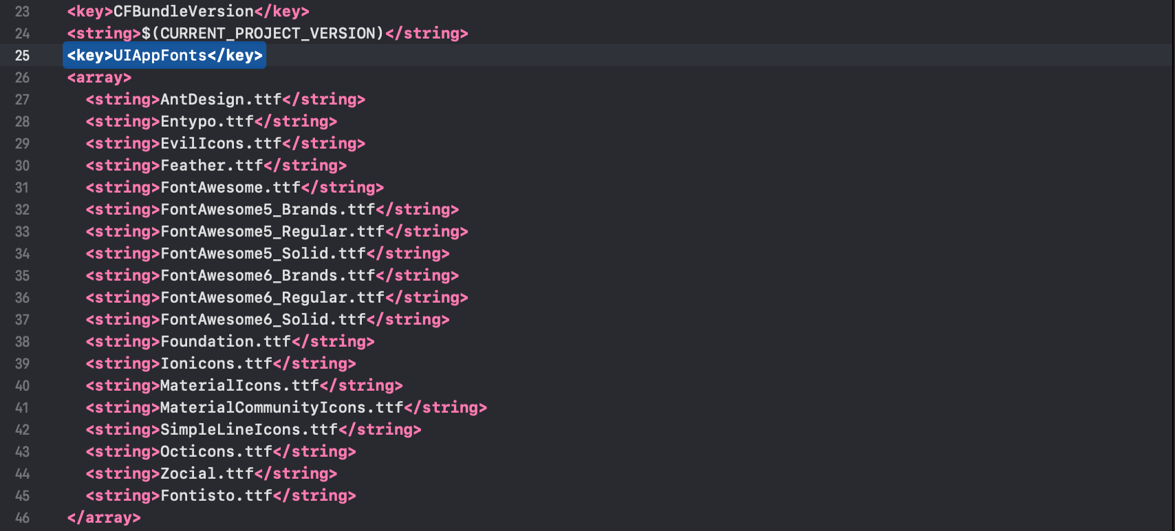
Next, copy the fonts below into your Info.plist.
<key>UIAppFonts</key>
<array>
  <string>AntDesign.ttf</string>
  <string>Entypo.ttf</string>
  <string>EvilIcons.ttf</string>
  <string>Feather.ttf</string>
  <string>FontAwesome.ttf</string>
  <string>FontAwesome5_Brands.ttf</string>
  <string>FontAwesome5_Regular.ttf</string>
  <string>FontAwesome5_Solid.ttf</string>
  <string>FontAwesome6_Brands.ttf</string>
  <string>FontAwesome6_Regular.ttf</string>
  <string>FontAwesome6_Solid.ttf</string>
  <string>Foundation.ttf</string>
  <string>Ionicons.ttf</string>
  <string>MaterialIcons.ttf</string>
  <string>MaterialCommunityIcons.ttf</string>
  <string>SimpleLineIcons.ttf</string>
  <string>Octicons.ttf</string>
  <string>Zocial.ttf</string>
  <string>Fontisto.ttf</string>
</array>
Note: You can only select the fonts you would like to use in your React Native Application.
After you added these fonts the Info.plist file should look like this:
Add
fonts.gradlefor Android.
Open android/app/build.gradle (NOT android/build.gradle) and add the following code to the bottom:
apply from: file("../../node_modules/react-native-vector-icons/fonts.gradle")
If you want to customize fonts, use:
project.ext.vectoricons = [
    iconFontNames: [ 'MaterialIcons.ttf', 'EvilIcons.ttf' ]
]

apply from: file("../../node_modules/react-native-vector-icons/fonts.gradle")
Original instructions can be found on Github: https://github.com/oblador/react-native-vector-icons